Self-service Analytics

Artificial Intelligence, Business Intelligence, Company, Data Governance, Data Marketing, Data Mining and Data Integration, Machine Learning, Self-service Analytics

Lean UX Design: the key to revolutionizing your BI development

What is Lean UX Design and why is it crucial to your BI?

In the dynamic world of Business Intelligence (BI), where the complexity of data meets the evolving needs of users, Lean UX Design is emerging as a revolutionary approach. This user-centered methodology promises to radically transform the way we design and develop BI solutions.

Lean UX design in brief

  • User-centered approach
  • Rapid iterations and continuous feedback
  • Cross-functional collaboration
  • Waste reduction and resource optimization
  • Agile adaptation to change
But how can Lean UX concretely improve your BI projects? Let’s delve into the details.

The 5 key steps of the Lean UX process in BI

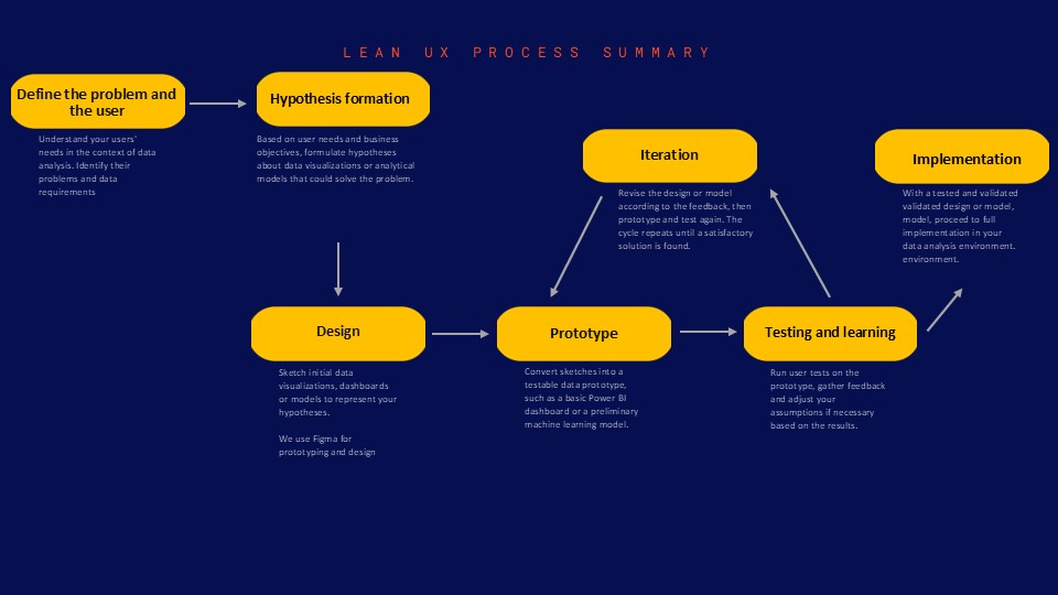
  1. Problem and user definition: gain an in-depth understanding of your BI users’ specific challenges.
  2. Ideation and hypotheses: formulate hypotheses about potential solutions.
  3. Rapid prototyping: create low-fidelity prototypes to test your ideas.
  4. User testing: get rapid feedback to validate or invalidate your hypotheses.

The tangible benefits of Lean UX in BI development

1. Significant reduction in development time and costs

By quickly identifying what works and what doesn’t, Lean UX saves precious resources.

“Thanks to DATANALYSIS’ Lean UX approach, we reduced our BI development costs by 30% while increasing user satisfaction by 50%.”

– Marie Dupont, CIO, TechInnovate SA

2. Improved user experience and adoption of BI tools

BI solutions designed with users, for users, guarantee better adoption and use.

3. Greater agility and adaptability to market changes

In an ever-changing BI environment, Lean UX enables you to pivot quickly and efficiently.

Here are the 5 steps to implementing Lean UX in your BI projects :

Integrating Lean UX into your BI strategy: where to start?

Adopting Lean UX in your BI development can seem daunting.

Here are some steps to get you started:

  1. Assess your current UX maturity
  2. Train your teams in Lean UX principles
  3. Start with a pilot project
  4. Measure and communicate results
  5. Gradually extend the approach to other projects

CONCLUSION

In a world where data is king, Lean UX offers a way to turn that data into actionable insights faster and more accurately than ever before. For companies looking to make the most of their BI investments, Lean UX isn’t just an option, it’s a competitive necessity.

At BUSINESS LAB CONSULTING, we’re passionate about applying Lean UX to BI development. Our team of experts is ready to guide you through this transformation to optimize your processes, reduce your costs and significantly improve the user experience of your BI solutions.

Want to learn more ?
Schedule a free consultation with our Lean UX experts
Data Governance, Data Marketing, Data Mining and Data Integration, Data visualisation, Machine Learning, Self-service Analytics

DATA: 7 Pitfalls to Avoid, Ep 6/7 – Graphical blunders

How to Avoid Common Errors in Data Visualization

Data visualization is a powerful tool for communicating complex information clearly and concisely. However, it can also be a source of numerous errors that can lead to misinterpretations. In this episode, we’ll explore the most common graphical gaffes and how to avoid them.

Pitfall 6A: Misleading Graphs

One of the most common pitfalls in data visualization is creating graphs that mislead, often unintentionally. This can happen in several ways:

  1. Truncating the Y-axis: By not starting the Y-axis at zero, visual differences between values can be exaggerated.
  2. Choosing an inappropriate scale: A poorly chosen scale can hide or exaggerate important trends.
  3. Using 3D graphs: 3D graphs can distort the perception of proportions.

For example, consider this graph showing drug-related crime cases in Orlando:

This graph seems to show an alarming increase in drug-related crimes. However, upon closer examination, we see that the Y-axis doesn’t start at zero, visually exaggerating the increase.

Pitfall 6B: Data Dogmatism

It’s easy to fall into the trap of data dogmatism, thinking there’s only one « right » way to visualize data. In reality, the choice of graph type depends on the context, audience, and message you want to convey.

For example, although pie charts are often criticized, they can be effective for showing parts of a whole, especially when there are few categories:

This pie chart clearly shows that theft accounts for nearly half of all reported crimes in Orlando.

Pitfall 6C: The false optimization/satisfaction dichotomy

In data visualization, one can fall into the trap of thinking that we must always seek the « optimal » visualization at the expense of « satisfactory » solutions. In reality, it’s often more practical and effective to find a visualization that meets the needs sufficiently well, rather than spending excessive time seeking perfection.

For example, this horizontal bar chart can be « satisfactory » for showing the most common types of crimes, even if it’s not necessarily « optimal »:

This graph is easy to understand and quickly provides essential information, even if it could potentially be optimized further.

CONCLUSION

In this article, we explored the sixth type of error we can encounter when working with data: graphical gaffes. We’ve seen how to avoid misleading graphs, data dogmatism, and the false dichotomy between optimization and satisfaction.

In the next and final article in our series, we’ll explore the 7th type of error: design dangers. We’ll see how design choices can affect the perception and interpretation of visualized data.

This series of articles is strongly inspired by the book « Avoiding Data Pitfalls – How to Steer Clear of Common Blunders When Working with Data and Presenting Analysis and Visualizations » written by Ben Jones, Founder and CEO of Data Literacy, WILEY edition. We highly recommend this excellent read to deepen your understanding of data-related pitfalls and how to avoid them!

You can find all the topics covered in this series here: https://www.businesslab.mu/blog/artificial-intelligence/data-7-pitfalls-to-avoid-the-introduction/

Business Intelligence, Data Governance, Data Marketing, Data Mining and Data Integration, Data Quality Management, Data Regulations, Data visualisation, Machine Learning, Self-service Analytics

DATA: 7 Pitfalls to Avoid, Ep 5/7 – Analytical aberrations

Intuition and Analysis are Not Mutually Exclusive

In our quest to make the most of data, we often fall into the trap of considering intuition and analysis as mutually exclusive approaches. However, as we’ll see in this episode on analytical aberrations, intuition plays a crucial role in the data analysis process.

Pitfall 5A: the False Intuition/Analysis Dichotomy

There was a time when advertisements boasted about moving from intuition to analysis in decision-making. This view is mistaken. Intuition isn’t obsolete in the data age – it’s actually more valuable than ever.

Intuition is the spark that powers the engine of analysis. It helps us:

  1. Know WHY the data is important
  2. Understand WHAT the data is telling us (and isn’t telling us)
  3. Know WHERE to look next
  4. Know WHEN to stop analyzing and take action
  5. Know WHO needs to hear the results and HOW to communicate them

Pitfall 5B: Exuberant Extrapolations

Predicting the future from data can be risky. Extrapolating current trends can lead to significant errors if we don’t account for natural limits or potential changes.

For example, if we look at life expectancy in North and South Korea from 1960 to 1980, we might be tempted to predict a continuous, linear increase. However, reality turned out quite differently, especially for North Korea, which experienced a significant decline in the 1990s.

Pitfall 5C: Ill-Advised Interpolations

When working with time-series data, we must be careful in our interpretations between data points. A simple slope graph connecting two points in time can mask significant fluctuations between these points.

For example, consider life expectancy in certain countries between 1960 and 2015. A simple slope graph showing the change between these two years could give the impression of a steady and constant increase. However, this simplified representation would mask periods of conflict, economic hardship, or rapid progress in public health that significantly impacted life expectancy over the years.

Take the case of Cambodia, Timor-Leste, Sierra Leone, and Rwanda. A simple slope graph would show an increase in life expectancy between 1960 and 2015, but would completely obscure the tragic periods of war and genocide these countries experienced. For instance, life expectancy in Cambodia fell to less than 20 years in 1977 and 1978, a crucial fact that would be completely ignored in a simple interpolation between 1960 and 2015.

This graph shows the actual evolution of life expectancy in these countries, revealing the dramatic fluctuations masked by a simple linear interpolation.

Pitfall 5D: Funky Forecasts

Forecasts, especially long-term ones, can be particularly prone to errors. A striking example is the unemployment forecasts made by different U.S. presidential administrations. These forecasts tend to show a rapid return to a « normal » rate of 4-6%, regardless of the actual economic situation.

This phenomenon can be explained by several factors. First, there’s political pressure to present optimistic outlooks. Second, there’s a natural tendency to assume that extreme or unusual situations will correct themselves quickly. Finally, forecasting models are often based on historical data and may not adequately account for structural changes in the economy.

For example, during the 2008 financial crisis, unemployment forecasts made just before or at the beginning of the crisis failed to anticipate the magnitude and duration of the increase in unemployment. Similarly, forecasts made at the height of the crisis often underestimated the time it would take for the unemployment rate to return to pre-crisis levels.

This graph shows how different presidential administrations have consistently predicted a rapid return to a « normal » unemployment rate, even in the face of very different economic realities.

Pitfall 5E: Moronic Measures

It’s crucial to ensure that the measures we use are relevant and meaningful. Too often, we focus on measures that are easy to obtain rather than those that are truly important for understanding a phenomenon or making decisions.

In sports, for example, many traditional measures can be misleading. Take the case of professional basketball: a player’s average speed on the court might seem like an interesting measure, but it doesn’t necessarily reflect the player’s real impact on the game.

LeBron James, one of the best players of all time, was criticized during the 2018 playoffs for having the lowest average speed on the court. However, this measure didn’t account for his real impact on the game, measured by more relevant statistics like the Player Impact Estimate (PIE).

This graph shows the relationship between average speed and PIE for NBA players. We can see that LeBron James (point in the top left) has a very high PIE despite a relatively low average speed, illustrating why average speed alone is an inadequate measure of a player’s performance.

This case illustrates the importance of choosing measures that truly reflect what we’re trying to evaluate, rather than settling for measures that are easy to obtain but potentially misleading.

In this article, we explored the fifth type of error we can encounter when using data to illuminate the world around us: analytical aberrations. We’ve seen how intuition and analysis can work together, and how to avoid the pitfalls of exuberant extrapolations, ill-advised interpolations, funky forecasts, and moronic measures.

In the next article, we’ll explore the 6th type of error in our series: graphical gaffes. We’ll see how errors in data visualization can lead to misinterpretations and poorly informed decisions.

This series of articles is strongly inspired by the book « Avoiding Data Pitfalls – How to Steer Clear of Common Blunders When Working with Data and Presenting Analysis and Visualizations » written by Ben Jones, Founder and CEO of Data Literacy, WILEY edition. We highly recommend this excellent read to deepen your understanding of data-related pitfalls and how to avoid them!

You can find all the topics covered in this series here: https://www.businesslab.mu/blog/artificial-intelligence/data-7-pitfalls-to-avoid-the-introduction/

Artificial Intelligence, Business Intelligence, Data Governance, Data Marketing, Data Mining and Data Integration, Data Quality Management, Data Regulations, Data visualisation, Machine Learning, Self-service Analytics

DATA: 7 pitfalls to avoid, Ep 4/7 – Statistical errors – Facts are stubborn things, but statistics are malleable

“There are lies, damned lies and statistics” B.Disraeli


Why such distaste for a field that, according to Webster’s Merriam-dictionary, is simply “a branch of mathematics dealing with the collection, analysis, interpretation and presentation of masses of numerical data. ”1 Why is the field of statistics in such a negative light by so many people?

There are four main reasons

  • It’s a complex field. Even the basic concepts are not easily accessible and are very difficult to explain.
  • Even the best-intentioned experts can misapply the tools at their disposal.
  • The third reason behind all this hatred is that those with an agenda can easily create statistics to lie about when communicating with us.
  • The final reason is that statistics can often seem cold and distant, making them very difficult for the public to grasp.

Descriptive setbacks

Descriptive statistics are intended to summarize the main characteristics of a data set. However, incorrect or inappropriate use can lead to misleading conclusions. A typical example is the use of the mean to summarize a distribution, without taking into account variability or skewness. Another common error is to present percentages without explaining the total number of people, which can be misleading as to the true extent of a phenomenon. It is therefore crucial to understand the assumptions and limitations of each descriptive measure in order to use it correctly.

Let’s take the example of analyzing salaries within a company. If we simply look at average salaries, we might conclude that the company is paying its employees well. However, if management salaries are very high compared to the rest of the employees, the average would be biased upwards. It would be more relevant to use the median, which gives the salary in the middle, or to look at the complete salary distribution for a more accurate view.

This error is very well described here with cats:

Inferential fires

Always a feline explanation:

Statistical inference aims to draw conclusions about a population from a sample of that population. However, this process is subject to error. Sampling errors and Type I and II errors are common. In addition, errors can be exacerbated by confusion between correlation and causation. A solid understanding of the principles of statistical inference is essential to avoid these pitfalls.

Let’s imagine a public health study seeking to establish a link between a particular dietary habit (such as eating organic) and better overall health. If the study finds a positive correlation, it doesn’t necessarily mean that eating organic causes better health. There could be confounding factors, such as income level or lifestyle, that influence both eating habits and health status. Here, we can fall into the trap of confusing correlation with causation.

Sliding sampling

Sampling is a crucial stage in any data collection process. Yet many errors can occur at this stage. The sample may not be representative of the target population, due to selection bias or non-response. What’s more, the sample size may be insufficient to detect an effect. Careful sample planning is therefore essential to obtain reliable results.

Consider a customer satisfaction survey conducted by an e-commerce company. If the company only solicits opinions from customers who have made a recent purchase, it runs the risk of obtaining a distorted picture of overall customer satisfaction. Indeed, dissatisfied customers may have stopped making purchases and therefore not be included in the sample. This is an example of selection bias.

Insensitivity to sample size

A common mistake in data analysis is to ignore the impact of sample size on results. A large sample size can make a very small effect significant, while too small a sample size may not have sufficient power to detect an existing effect. Furthermore, statistical significance does not necessarily mean practical significance. So it’s important to consider sample size when interpreting results.

Suppose you’re conducting a study to assess the effect of a drug on lowering blood pressure. If you have a very large sample of patients, you may see a statistically significant drop in blood pressure. However, this drop may be very small, say 0.1 mm Hg, a clinically insignificant value despite its statistical significance. This is an example where sample size can make a small effect significant. On the other hand, if the sample is too small, a real effect may be missed. It is therefore important to consider clinical or practical significance in addition to statistical significance.

Digging deeper into this issue, Ben Jones (see author who inspired this article) managed to find figures on kidney cancer rates as well as demographics for every US county, and he created an interactive dashboard (figure below) to visually illustrate the fact that Kahneman, Wainer and Zwerlink are doing quite clearly in words.

Notice a few elements in the dashboard. On the choropleth map (filled in), the darkest orange counties (high rates relative to the overall U.S. rate) and the darkest blue counties (low rates relative to the overall U.S. rate) are often side by side.

Also, note how in the scatterplot below the map, the marks form a funnel shape, with less populated counties (on the left) more likely to deviate from the reference line (the overall U.S. rate), and more populated counties like Chicago, L.A. and New York are more likely to be close to the overall reference line.


One final observation: if you hover over a county with a small population in the interactive online version, you’ll notice that the average number of cases per year is extremely low, sometimes 4 cases or less. A small deviation – even just 1 or 2 cases – in a subsequent year will pull a county from the bottom of the list to the top, or vice versa.


In the next article, we’ll explore the 5th type of error we may encounter when using data to illuminate the world around us: Analytical aberrations.

This article is heavily inspired by the book “Avoiding Data pitfalls – How to steer clear of common blunders when working with Data and presenting Analysis and visualization” written by Ben Jones, Founder and CEO of Data Litercy, WILEY edition. We recommend this excellent read!

You can find all the topics covered in this series here: https://www.businesslab.mu/blog/artificial-intelligence/data-7-pitfalls-to-avoid-the-introduction/

Business Intelligence, Data Governance, Data Marketing, Data Mining and Data Integration, Data Regulations, Machine Learning, Self-service Analytics, Technology

DATA: 7 pitfalls to avoid. Ep 3/7 – Mathematical errors: how are data calculated?

We’ve all expressed disbelief at the relevance of mathematics to our daily lives. What purpose could this dense, complex subject possibly serve? Well, in a world where data is everywhere and infuses every strategic decision made by organizations, mathematics is vitally important (editor’s note: it always has been!).

In our data analysis projects, mathematical errors can occur as soon as a calculated field is created to generate additional information from our initial dataset. This type of error can be found, for example, when :

  • We perform aggregations (sum, mean, median, minimum, maximum, count, separate count etc.) at different levels of detail
  • We make divisions to produce ratios or percentages
  • We work with different units

These are obviously just a few of the types of operation where errors can occur. But in our experience, these are the main causes of the problems we encounter.

And, in each of these cases, it doesn’t take a genius engineer or scientist to correct them. It just takes a little care and a lot of rigor!

1. Unit processing errors

In this article, we won’t dwell too much on this common mistake. In fact, there are a large number of articles and anecdotes which illustrate this type of problem perfectly and in detail (which we also discussed in the previous article).

The most famous and costly example is the crash of the Mars Orbiter probe. If you’d like to find out more, please click here: Mars Climate Orbiter – Wikipedia

You may argue that none of us is part of NASA and has to land a probe on a distant planet, so we’re not concerned. Well, you may well come across this type of error when handling time data (hours, days, seconds, minutes, years), financial data (different currencies), or managing stocks (units, kilos, pallets, bars etc.).

2. Aggravation of aggregations

We aggregate data when we group records that have an attribute in common. There are all sorts of such groupings that we deal with in our world as soon as we can establish hierarchical links; time (day, week, month, year), geography (cities, region, country), organizations (employees, teams, companies) and so on.

Aggregations are a powerful tool for apprehending the world, but beware, they involve several risk factors:

  • Aggregations summarize a situation and do not present detailed information. Anyone who has taken part in a datavisualization training course with our teams is familiar with Anscombe’s quarter:

The statistical summary is a typical example of what aggregates can hide. In this example, the four data sets have exactly the same sums, means and standard deviations on both coordinates (X,Y). When we plot each of the points on curves, it’s easy to see that the 4 stories are significantly different.

As soon as data is aggregated, we try to summarize a situation. We must always remember that this summary masks the details and context that explain it. So be careful when, in a discussion, your interlocutors only talk about average values, sums or medians, without going into the details of what may have led to that particular scenario.

  • Aggregations can also mask missing values and be misleading. Indeed, depending on the way we represent information, the fact that data is missing may not be clearly visible at first glance.

Take, for example, a dataset in which we observe the number of bird strikes on aircraft for an airline.

Our objective is to determine the month(s) of the year with the most incidents. This gives :

July appears to be the month with the highest number of impacts counted. However, if we look at the details by year, we realize that the aggregation chosen to answer our question did not allow us to determine that the seizures for the year 2017 stopped during this famous month of July:

The answer to our question was therefore August, if we exclude the data for the year for which we didn’t have all the records.

  • Totals and aggregations :

This is the last example of the problems linked to aggregations that we’re going to discover in this article. This is one of the author’s “favorite” mistakes. Some might even call it a specialty!

It comes into play when it’s necessary to count the distinct individuals in a given population. Let’s say we’re looking at our customer base and want to know how many unique individuals are in it.

Counting the distinct ids for the whole company gives us a count of our unique customers:

But if we look at each product line and display a sum without paying attention :

We found 7 more customers!

This happens simply because there are customers in the customer base of the company studied who take both services AND licenses, and who end up being counted twice in the total!

This is a problem with simple solutions in all modern datavisualization and BI software, but it tends to hide itself in a series of calculations and aggregations, causing sometimes surprising discrepancies at the end of the chain.

3. Panic on board, a ratio!

We’ll illustrate this point with an example taken from one of the dashboards we made for one of our customers. With all our expertise, we also sometimes jump headlong into this type of error:

And yes, we’re talking about an occupancy rate that’s “slightly” over 100%!

How is this possible? A simple oversight!

The sum of the divisions is not equal to the division of the sums…

In this case, we had a data set similar to the one below:

Is the occupancy rate equal to :

The sum of the individual occupancy rates? FALSE!

This gives us a total of 30% + 71% + 100% + 50% + 92% + 70%, i.e. 414%.

And that’s exactly the error we made on an even larger data set…

Or the ratio of total passengers to total available capacity? 125/146 = 86%. That’s more accurate!

Note: the average of individual occupancy rates would also be wrong.

In short, whenever a ratio is manipulated, it’s a question of dividing the total of the numerator and denominator values to avoid this type of problem.

This is just one example of a ratio error. Honorable mentions can be given to the treatment of NULL values in a calculation, or to the comparison of ratios that are not calculated with the same denominators.

In the next article, we’ll explore the 4th type of obstacle we may encounter when using data to shed light on the world around us:

Statistical slippage. (Spoilers: “There are lies, damned lies and statistics” B.Disraeli)

This article was strongly inspired by the book “Avoiding Data pitfalls – How to steer clear of common blunders when working with Data and presenting Analysis and visualization” written by Ben Jones, Founder and CEO of Data Litercy, WILEY edition. We recommend this excellent read!

You can find all the topics covered in this series here: https://www.businesslab.mu/blog/artificial-intelligence/data-7-pitfalls-to-avoid-ep-2-7-technical-errors-how-is-data-created/

Business Intelligence, Company, CRM, Data Governance, Data Marketing, Data Mining and Data Integration, Data Quality Management, Data Regulations, Machine Learning, Self-service Analytics

DATA: 7 pitfalls to avoid. Ep 2/7 – Technical errors: how is data created?

Having defined a few key data-related concepts, we can now delve into the technical issues that can lead to errors. This article deals with the problems associated with the process of obtaining the data that will subsequently be used. It’s about building the foundations of our analyses.

And it goes without saying that we don’t want to build a house of cards on sand!

To stay with the construction metaphor, if problems of this nature exist, they will be hidden and barely visible in the final building. Particular care must therefore be taken during the data collection, processing and cleaning stages. It’s not for nothing that it’s estimated that 80% of the time spent on a data science project is spent on this type of task.

To avoid falling into this trap, and to limit the load required to carry out these potentially tedious operations, we need to accept three fundamental principles:

  • Virtually all datasets are not clean and need to be cleaned and formatted.
  • Each transition (formatting, join, link, etc.) during the preparation stages is a potential source of new error
  • It is possible to learn techniques to avoid the creation of errors arising from the first two principles.

Accepting these principles does not remove the obligation to go through this preliminary work before any analysis, but the good news is that knowing how to identify these risks, and learning as we go along, helps to limit the scope of this second obstacle.

1. The trap of dirty data.

Data is dirty. I’d even go so far as to say that all data is dirty (see first principle above), with problems of formatting, data entry, inconsistent units, NULL values and so on.

Some well-known examples of this trap

Take the crash of NASA’s Mars Climate Orbiter in 1999, for example. A $125 million error caused by a dual unit system: imperial and metric units. This led to an erroneous calculation that affected the power sent to the probe’s thrusters and its destruction.

Fortunately, not all errors of this nature will cost us so much money! But they do have a significant impact on the results and ROI of the analyses we carry out.

So, at DATANALYSIS, we’re currently running several projects specifically on data quality in the context of DATA Marketing, and we’re dealing with two types of subject:

  • Data validation, which aims to improve data quality through data processing, by :

-Standardizing fields (phone number, email, etc.): +262 692 00 11 22 / 00262692001122 / 06-92-00-11-22 correspond to the same line, and we can automate much of this work thanks to appropriate processing;

– Filling in empty fields using other data in the table. For example, we can deduce the country of residence from telephone numbers, zip codes, cities, etc.


  • Deduplication, by :

-Using adapted rules to identify potentially identical lines. Two records with the same e-mail address, telephone number or company ID;

-Using distance calculation algorithms to define similar values in terms of spelling, pronunciation, common characters, etc.

From these examples and our own experience, we can see that this type of error mainly stems from data entry, collection or “scrapping” processes, whether implemented automatically or by humans. So, in addition to the solutions that can be implemented in data preparation processes, improving these preliminary steps will also greatly improve the quality of the data to be processed, and this requires education, training and the definition of rules and standards that are clearly known and shared (data governance is never far away).

Finally, we should also ask ourselves when we can consider this stage to be sufficiently clean. After all, we can always do more and better, but the costs involved can often outweigh the expected returns.

2. The data transformation trap

In the IT world, there’s an image that sums up this type of problem:

Often, the mistake lies between the screen and the seat!

And yes, even the best data scientists, data analysts or data engineers can make mistakes in the data cleansing, transformation and preparation stages.

Frequently, we manipulate several files from different sources and different applications, which multiplies the risks associated with dirty data issues and the risks when manipulating the files themselves:

  • Different levels of granularity
  • Joins on fields whose values are not exactly identical (e.g. ST-DENIS vs SAINT DENIS).
  • Different file perimeters

And this problem can also be made more complex depending on the tools used in our analyses:

  • In Tableau, for example, we can perform data joins, relations or links to link several datasets together. Each type of operation has its own rules and constraints.
  • In Qlik, you need to understand how the associative engine works and the associated modeling rules, which differ from those of a traditional BI model.

In this case, it’s often a question of technical constraints linked to the very business of data preparation, and taking the time to understand the risks and processes in place will save a great deal of time in delivering reliable, high-performance data analysis.

In the next article, we’ll explore the 3rd type of obstacle we may encounter when using data to shed light on the world around us: Mathematical errors.

This article was strongly inspired by the book “Avoiding Data pitfalls – How to steer clear of common blunders when working with Data and presenting Analysis and visualization” written by Ben Jones, Founder and CEO of Data Litercy, WILEY edition. We recommend this excellent read!

You can find all the topics covered in this series here : https://www.businesslab.mu/blog/artificial-intelligence/data-7-pitfalls-to-avoid-ep-1-7-epistemological-errors-how-do-we-think-about-data/

Business Intelligence, Company, Data Governance, Data Marketing, Data Mining and Data Integration, Data Quality Management, Data Regulations, Data Warehouse, Machine Learning, Self-service Analytics, Technology

Getting started with Business Intelligence: practical tips

« Wisdom is about extracting gold from raw data; with sharp Business Intelligence, every piece of information becomes a nugget. »

This adage perfectly sums up the potential of BI, provided you follow a few practical tips. Existing information goldmines allow companies to turn them into nuggets of gold shaped in their own image.

Definition

Business Intelligence (BI) is a set of processes, technologies and tools used to collect, analyse, interpret and present data in order to provide actionable information to an organisation’s decision-makers and stakeholders. The main objective of BI is to help companies make strategic decisions based on reliable and relevant data.

BI is widely used in many areas of business, such as financial management, human resources management, marketing, sales, logistics and supply chain, among others. In short, Business Intelligence aims to transform data into actionable knowledge to improve an organisation’s overall performance.

Before looking at the practical tips, let’s look at the elements that define BI. To put BI into practice within your business, there are 5 main steps you need to follow to achieve relevant and effective BI.

Data collection

Data is collected from a variety of sources inside and outside the company, such as transactional databases, business applications, social media, customer surveys, etc.

Data cleansing and transformation 

The data collected is cleaned, normalised and transformed into a format that is compatible for analysis. This often involves eliminating duplicates, correcting errors and standardising data formats.

Data analysis

Data is analysed using various techniques such as statistical analysis, data mining, predictive models and machine learning algorithms to identify trends, patterns and insights.

Data visualisation

The results of analysis are generally presented in the form of dashboards, reports, graphs and other interactive visualisations to facilitate understanding and decision-making.

Informations dissemination

The information obtained is shared with decision-makers and stakeholders throughout the organisation, enabling them to make informed decisions based on reliable data.

Practical tips

Now that we have a broad understanding of the definition of BI, it’s important to remember that getting started with Business Intelligence (BI) can be a challenge, but with a strategic approach and some practical advice, you can put in place an effective infrastructure for your business.
Here are some practical tips for getting started with relevant and effective Business Intelligence.

Clarify your objectives

Before you start implementing BI, clearly identify the business objectives you want to achieve. Whether you want to improve decision-making, optimise business processes or better understand your customers, clear objectives will help you focus your efforts.

Start with the basics

Don’t try to do everything at once. Start with pilot projects or specific initiatives to familiarise yourself with BI concepts and tools. This will also enable you to measure results quickly and adjust accordingly.

Identify your data sources

Identify your organisation’s internal and external data sources. This can include transactional databases, spreadsheets, CRM systems, online marketing tools, etc. Ensure that the data you collect is reliable, complete and relevant to your objectives.

Clean and prepare your data

Data quality is essential for effective BI. Put processes in place to clean, standardise and prepare your data before analysing it. This often involves eliminating duplicates, correcting errors and standardising data formats.

Choose the right tools

There are many BI solutions on the market, so look for those that best suit your needs. Considers factors such as ease of use, the ability to manage large sets of data, integration with your existing systems and cost.

Train your team

Make sure your team is formed to use BI tools and interpretation of data. BI is a powerful tool, but its effectiveness depends on the ability of your team to use it properly.

Communicate and collaborate

Involve stakeholders from the start of the BI implementation process. Their support and comments will be essential to ensure the long-term success of your initiative BI.

Start small and grow

Don’t try to implement all BI functionalities at once. Start with pilot projects or specific initiatives, and then gradually extend your use of BI according to the results obtained.

Involve stakeholders

Involve stakeholders right from the start of the BI implementation process. Their support and feedback will be essential in ensuring the long-term success of your BI initiative.

Measure and adjust

Track the performance of your BI and measure its impact on your business. Use this information to identify areas for improvement and make adjustments to your BI strategy over time.

By following these initial practical tips, you can get off to a good start with Business Intelligence and start leveraging your data to make informed decisions and drive business growth.

CONCLUSION

A Business Intelligence (BI) project is considered successful when it succeeds in adding value to the business by meeting its business objectives effectively and efficiently. Here are some key indicators that can define a successful BI project:

Alignment with business objectives: the BI project must be aligned with the company’s strategic objectives. It must contribute to improving decision-making, optimising business processes, increasing profitability or strengthening the company’s competitiveness.

Effective use of data: a successful BI project makes effective use of data to provide usable information. This means collecting, cleansing, analysing and presenting data in the right way to meet business needs.

User adoption: end-users must adopt BI tools and use them on a regular basis to make decisions. A successful BI project is one that meets users’ needs and is easy to use and understand.

Improved performance: a successful BI project translates into improved business performance. This can take the form of increased sales, reduced costs, improved productivity or any other performance measure relevant to the business.

Positive return on investment (ROI): a successful BI project generates a positive return on investment for the business. This means that the benefits gained from using BI outweigh the costs of implementing and maintaining the project.

Scalability and flexibility: a successful BI project is capable of adapting to the changing needs of the business and evolving with it. It must be flexible enough to support new needs, new types of data or new usage scenarios.

Management support and commitment: a successful BI project benefits from the support and commitment of the company’s management. Management must recognise the value of BI and provide the necessary resources to support the project throughout its lifecycle.

In summary, a successful BI project is one that contributes to achieving the company’s business objectives by effectively using data to make informed decisions. It is characterised by its alignment with business objectives, its adoption by users, its positive impact on business performance and its positive return on investment.

Did this article inspire you ?
Artificial Intelligence, Business Intelligence, Company, Data Governance, Data Marketing, Data Mining and Data Integration, Data Quality Management, Machine Learning, Self-service Analytics, Technology

Informed decision-making: fast and effective

« Promptness in decision-making is the pillar of success, but data insight is the foundation »

This adage perfectly sums up the subject of effective and rapid decision-making, which in the majority of businesses is based on data.

In today’s business world, data has become the fuel that drives strategic decision-making. From planning day-to-day operations to developing long-term strategies, businesses are now leveraging data to guide their choices and improve their overall effectiveness.

Here’s how data-driven decisions can radically transform your business. Whether you’re a leader in your sector or expanding into a new market, you’ll inevitably have to make strategic decisions that will affect your business.

Knowing that the wrong decision can have serious consequences for your project, and even for your company, it’s essential to have the right processes, decision-making tools and, above all, data.

Accuracy and relevance

Data-driven decisions are based on tangible, factual information, eliminating guesswork and hunches that are often prone to error. By using accurate, up-to-date data, businesses can make more informed and relevant decisions, reducing the risk of costly errors.

Identifying trends

By analysing large data sets, businesses can identify significant trends and recurring patterns. This enables them to anticipate market changes, identify new opportunities and stay ahead of the competition.

Personalising customer experiences

Customer behaviour data enables businesses to create personalised, tailored experiences. By understanding individual customer needs and preferences, businesses can offer better-tailored products and services, boosting customer loyalty and satisfaction.

Using technology to accelerate & optimise the process

Operational data enables companies to optimise their internal processes. By identifying inefficiencies and bottlenecks, companies can make precise adjustments to improve productivity, reduce costs and increase overall operational efficiency.

Data processing technologies such as artificial intelligence (AI), machine learning and predictive analytics can accelerate the decision-making process by automating repetitive tasks and providing actionable insights in real time. Advanced algorithms can detect subtle patterns in data, helping decision-makers to make better and faster decisions.

Data-driven decisions: the key to agility & agile decision-making

With real-time access to data, businesses can make decisions faster and more agilely. Using real-time dashboards and analysis, decision-makers have the information they need to react quickly to market changes and new opportunities.

Informed decision-making depends on access to accurate, up-to-date data. Companies that invest in data collection, analysis and visualisation systems are better equipped to make rapid, informed decisions. By exploiting available data, they can quickly assess market trends, understand customer needs and identify opportunities for growth.

Speed without compromising quality

While speed is essential in a competitive business environment, this does not mean sacrificing the quality of decisions. Data provides an objective framework on which to base choices, reducing the risk of costly errors associated with impulsive or ill-informed decision-making. By combining speed and accuracy, businesses can make effective decisions while maintaining a high level of quality and relevance.

The importance of a data culture

Beyond tools and technologies, informed decision-making depends on an organisational culture that values data and fosters collaboration. Companies that foster a data culture are better equipped to collect, analyse and effectively use information to make decisions. By encouraging transparency, communication and collaboration, these companies can fully exploit the potential of data to drive innovation and growth.

Conclusion

By adopting a data-driven approach, businesses can transform the way they make decisions, moving from an approach based on intuition to one based on tangible, verifiable data. As a result, they can improve operational efficiency, drive growth and maintain competitiveness in the ever-changing marketplace. Ultimately, businesses that fully embrace data-driven decision-making are better positioned to thrive in the modern economy.

Informed, data-driven decision-making offers an undeniable competitive advantage in the modern business environment. By combining speed and efficiency with the accuracy of data, businesses can adapt quickly to market changes, seize opportunities and maintain their position as leaders in their sector. By investing in advanced data processing technologies and fostering a data-driven culture within the organisation, businesses can successfully navigate an ever-changing world and thrive in the face of uncertainty.

Did this article inspire you ?
Business Intelligence, Company, Data Governance, Data Marketing, Data Mining and Data Integration, Data Quality Management, Data Regulations, Data Warehouse, Machine Learning, Self-service Analytics, Technology

Data Warehouses vs Data Lakes: a comparative dive into the Tech World

In the ever-evolving world of technology, two terms have been making waves: Data Warehouses and Data Lakes. Both are powerful tools for data storage and analysis, but they serve different purposes and have unique strengths and weaknesses. Let’s dive into the world of data and explore these two tech giants.

Data Warehouses have been around for a while, providing a structured and organized way to store data. They are like a well-organized library, where each book (data) has its place. Recent advancements have made them even more efficient. The convergence of data lakes and data warehouses, for instance, has led to a more unified approach to data storage and analysis. This means less data movement and more efficiency – a win-win!

Moreover, the integration of machine learning models and AI capabilities has automated data analysis, providing more advanced insights. Imagine having a personal librarian who not only knows where every book is but can also predict what book you’ll need next!

However, every rose has its thorns. Data warehouses can be complex and costly to set up and maintain. They may also struggle with unstructured data or real-time data processing. But they shine when there is a need for structured, historical data for reporting and analysis, or when data from different sources needs to be integrated and consistent.

On the other hand, Data Lakes are like a vast ocean of raw, unstructured data. They are flexible and scalable, thanks to the development of the Data Mesh. This allows for a more distributed approach to data storage and analysis. Plus, the increasing use of machine learning and AI can automate data analysis, providing more advanced insights.

However, without proper management, data lakes can become « data swamps », with data becoming disorganized and difficult to find and use. Data ingestion and integration can also be time-consuming and complex. But they are the go-to choice when there is a need for storing large volumes of raw, unstructured data, or when real-time or near-real-time data processing is required.

In depth

DATA WAREHOUSES

Advancements

1. Convergence of data lakes and data warehouses: This allows for a more unified approach to data storage and analysis, reducing the need for data movement and increasing efficiency.

2. Easier streaming of real-time data: This allows for more timely insights and decision-making.

3. Integration of machine learning models and AI capabilities: This can automate data analysis and provide more advanced insights.

4. Faster identification and resolution of data issues: This improves data quality and reliability.

Setbacks

1. Data warehouses can be complex and costly to set up and maintain.

2. They may not be suitable for unstructured data or real-time data processing.

Best scenarios for implementation

1. When there is a need for structured, historical data for reporting and analysis.

2. When data from different sources needs to be integrated and consistent.

DATA LAKES

Advancements

1. Development of the Data Mesh: This allows for a more distributed approach to data storage and analysis, increasing scalability and flexibility.

2. Increasing use of machine learning and AI: This can automate data analysis and provide more advanced insights.

3. Tools promoting a structured dev-test-release approach to data engineering: This can improve data quality and reliability.

Setbacks

1. Data lakes can become « data swamps » if not properly managed, with data becoming disorganized and difficult to find and use.

2. Data ingestion and integration can be time-consuming and complex.

Best scenarios for implementation

1. When there is a need for storing large volumes of raw, unstructured data.

2. When real-time or near-real-time data processing is required.

In conclusion, both data warehouses and data lakes have their own advantages and setbacks. The choice between them depends on the specific needs and circumstances of the organization. It’s like choosing between a library and an ocean – both have their charm, but the choice depends on what you’re looking for. So, whether you’re a tech enthusiast or a business leader, understanding these two tools can help you make informed decisions in the tech world. After all, in the world of data, knowledge is power!

This article inspired you ?
Artificial Intelligence, Business Intelligence, Change and Project Management, Data Governance, Data Marketing, Data Mining and Data Integration, Machine Learning, Self-service Analytics, Technology

Mastering your Data: the essence and impact of the data catalogue

In today’s hyper-connected world, where data is seen as the new gold, knowing how to manage and exploit it is essential for businesses wishing to make informed decisions and remain competitive. The concept of the data catalogue is emerging as a key response to this challenge, offering a compass in the vast and often tumultuous ocean of data.

This article aims to shed light on the challenges and benefits of data catalogues, modern libraries where metadata is not just stored, but made comprehensible and accessible. Through the automation of metadata documentation and the implementation of collaborative data governance, data catalogues are transforming the way organisations access, understand and use their valuable information.


By facilitating the discovery and sharing of trusted data, they enable organisations to navigate confidently towards a truly data-driven strategy.

But also...

A data catalogue is a centralised tool designed to effectively manage data within an organisation. According to Gartner, it maintains an inventory of active data by facilitating its discovery, description and organisation.

The basic analogy would be to say that it is a directory, where readers find the information they need about books and where they are: title, author, summary, edition and the opinions of other readers.

The aim of a data catalogue is to make data governance collaborative, by improving accessibility, accuracy and relevance of data for the business. It supports data confidentiality and regulatory compliance through intelligent data lineage tracing and compliance monitoring.

Here are 5 reasons for your data teams to use a data catalogue:

Data analysts / Business analysts

They use the data catalogue to find and understand the data they need for their analyses. This enables them to access relevant data quickly, understand its context and guarantee its quality and reliability for reporting and analysis.


Data Scientists

The data catalogue is essential for locating the datasets they need for their machine learning and artificial intelligence models. It also makes it easier to understand the metadata (where the data comes from and the transformations it has undergone), which is vital for data pre-processing.


Data Stewards

They are responsible for data quality, availability and governance. They use the data catalogue to document metadata, manage data standards, and monitor compliance and the use of data within the organisation.


Compliance and security managers

The data catalogue helps them to ensure that data is managed and used in accordance with current regulations, such as the GDPR for the protection of personal data. They can use it to track access to sensitive data and audit data use.


Data architects and engineers

These technicians use the data catalogue to design and maintain the data infrastructure. It provides them with an overview of the data available, its structure and its interrelationships, making it easier to optimise the data architecture and integrate new data sources.

It’s important to note that business users are not left out of this tool either. Although they are not technical users, they benefit from the data catalogue to access the information and insights they need to make decisions. The directory enables them to find relevant data easily, without the need for in-depth technical knowledge.

Key points

A data catalogue is used to:


  • Improve data discovery and access


  • Strengthen data governance


  • Improve data quality and reliability


  • Facilitate collaboration between teams


  • Optimise the use of data resources


With Data Catalogues, just as we now do with our own revolutionary DUKE solution, navigate the complex data landscape today, with the luxury of effectively accessing, managing and exploiting data to support informed decision-making and business innovation.

Let your Data teams shine today and dive straight into the heart of our DUKE project.