DATA: 7 Pitfalls to Avoid, Ep 5/7 – Analytical aberrations
Intuition and Analysis are Not Mutually Exclusive
In our quest to make the most of data, we often fall into the trap of considering intuition and analysis as mutually exclusive approaches. However, as we’ll see in this episode on analytical aberrations, intuition plays a crucial role in the data analysis process.
Pitfall 5A: the False Intuition/Analysis Dichotomy
There was a time when advertisements boasted about moving from intuition to analysis in decision-making. This view is mistaken. Intuition isn’t obsolete in the data age – it’s actually more valuable than ever.
Intuition is the spark that powers the engine of analysis. It helps us:
- Know WHY the data is important
- Understand WHAT the data is telling us (and isn’t telling us)
- Know WHERE to look next
- Know WHEN to stop analyzing and take action
- Know WHO needs to hear the results and HOW to communicate them
Pitfall 5B: Exuberant Extrapolations
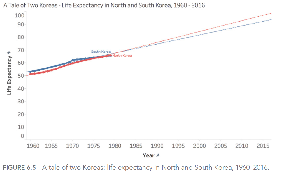
Predicting the future from data can be risky. Extrapolating current trends can lead to significant errors if we don’t account for natural limits or potential changes.
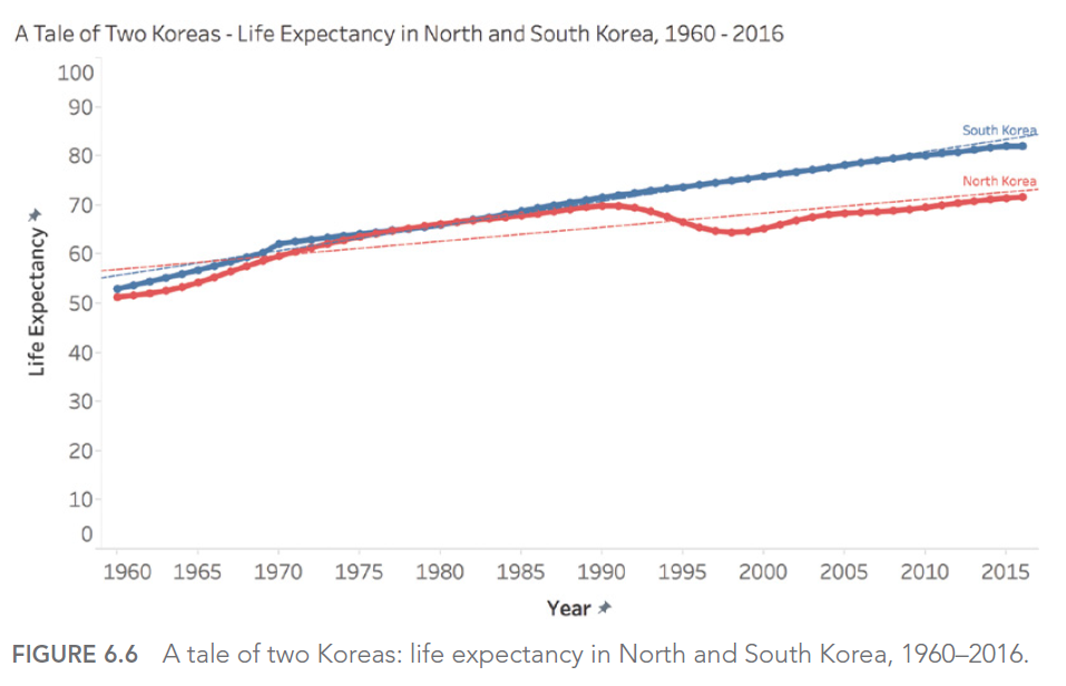
For example, if we look at life expectancy in North and South Korea from 1960 to 1980, we might be tempted to predict a continuous, linear increase. However, reality turned out quite differently, especially for North Korea, which experienced a significant decline in the 1990s.
Pitfall 5C: Ill-Advised Interpolations
When working with time-series data, we must be careful in our interpretations between data points. A simple slope graph connecting two points in time can mask significant fluctuations between these points.
For example, consider life expectancy in certain countries between 1960 and 2015. A simple slope graph showing the change between these two years could give the impression of a steady and constant increase. However, this simplified representation would mask periods of conflict, economic hardship, or rapid progress in public health that significantly impacted life expectancy over the years.
Take the case of Cambodia, Timor-Leste, Sierra Leone, and Rwanda. A simple slope graph would show an increase in life expectancy between 1960 and 2015, but would completely obscure the tragic periods of war and genocide these countries experienced. For instance, life expectancy in Cambodia fell to less than 20 years in 1977 and 1978, a crucial fact that would be completely ignored in a simple interpolation between 1960 and 2015.
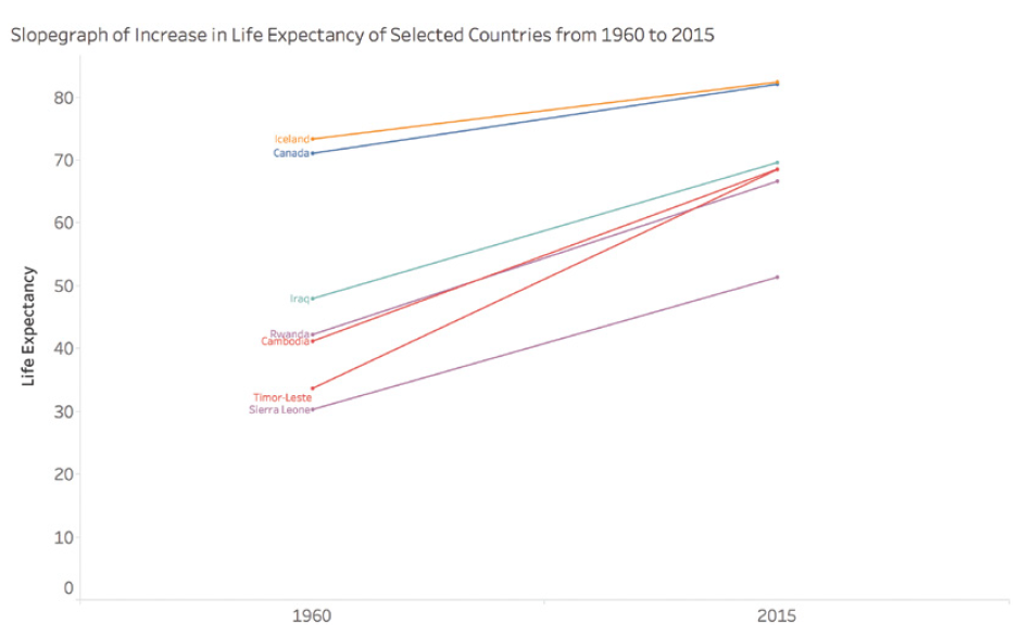
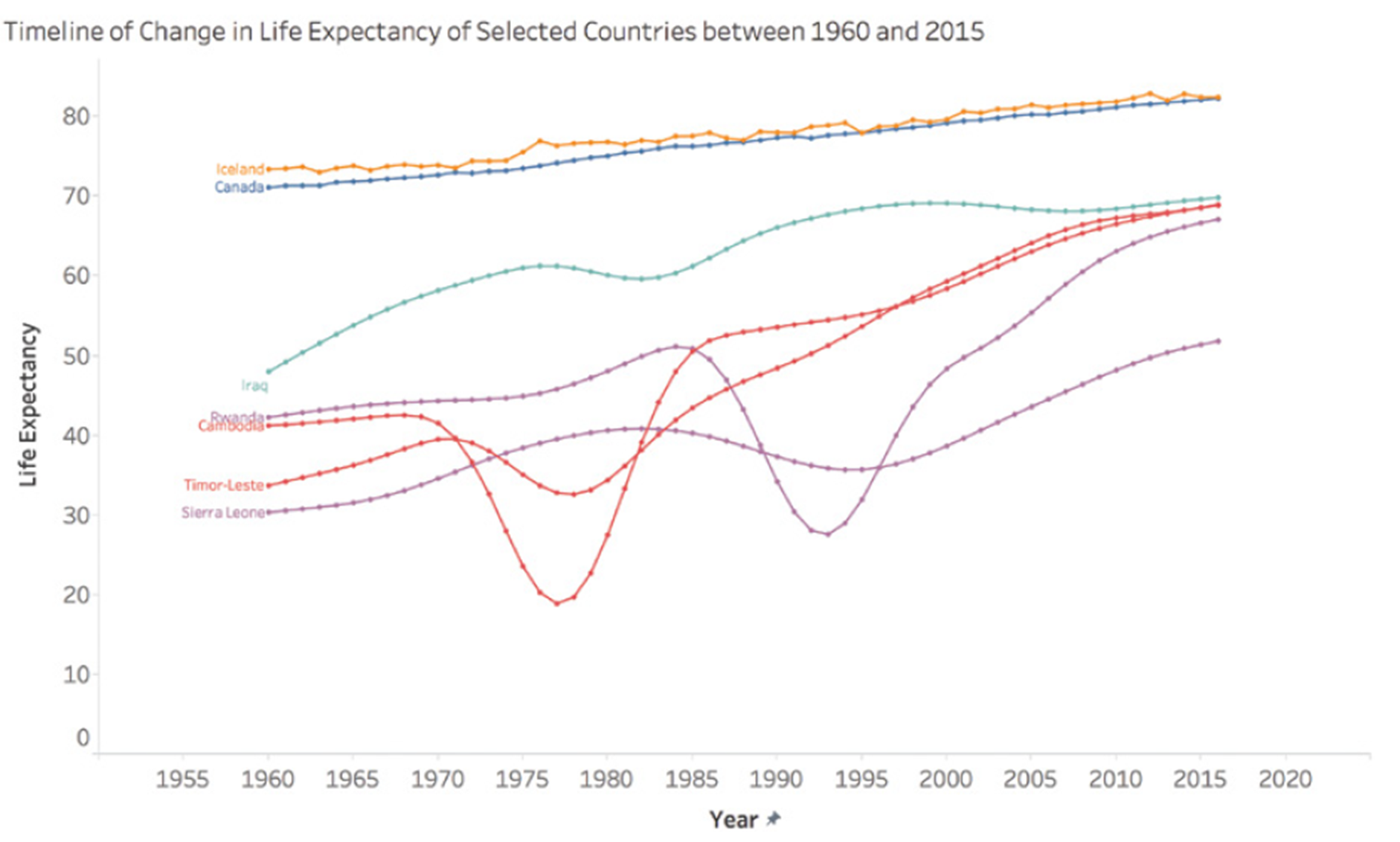
This graph shows the actual evolution of life expectancy in these countries, revealing the dramatic fluctuations masked by a simple linear interpolation.
Pitfall 5D: Funky Forecasts
Forecasts, especially long-term ones, can be particularly prone to errors. A striking example is the unemployment forecasts made by different U.S. presidential administrations. These forecasts tend to show a rapid return to a « normal » rate of 4-6%, regardless of the actual economic situation.
This phenomenon can be explained by several factors. First, there’s political pressure to present optimistic outlooks. Second, there’s a natural tendency to assume that extreme or unusual situations will correct themselves quickly. Finally, forecasting models are often based on historical data and may not adequately account for structural changes in the economy.
For example, during the 2008 financial crisis, unemployment forecasts made just before or at the beginning of the crisis failed to anticipate the magnitude and duration of the increase in unemployment. Similarly, forecasts made at the height of the crisis often underestimated the time it would take for the unemployment rate to return to pre-crisis levels.
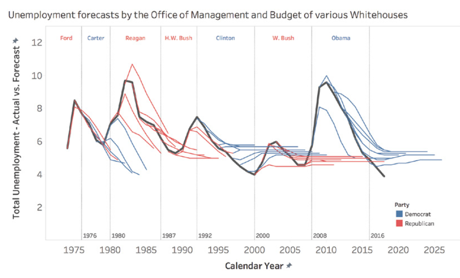
This graph shows how different presidential administrations have consistently predicted a rapid return to a « normal » unemployment rate, even in the face of very different economic realities.
Pitfall 5E: Moronic Measures
It’s crucial to ensure that the measures we use are relevant and meaningful. Too often, we focus on measures that are easy to obtain rather than those that are truly important for understanding a phenomenon or making decisions.
In sports, for example, many traditional measures can be misleading. Take the case of professional basketball: a player’s average speed on the court might seem like an interesting measure, but it doesn’t necessarily reflect the player’s real impact on the game.
LeBron James, one of the best players of all time, was criticized during the 2018 playoffs for having the lowest average speed on the court. However, this measure didn’t account for his real impact on the game, measured by more relevant statistics like the Player Impact Estimate (PIE).
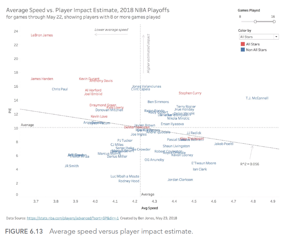
This graph shows the relationship between average speed and PIE for NBA players. We can see that LeBron James (point in the top left) has a very high PIE despite a relatively low average speed, illustrating why average speed alone is an inadequate measure of a player’s performance.
This case illustrates the importance of choosing measures that truly reflect what we’re trying to evaluate, rather than settling for measures that are easy to obtain but potentially misleading.
In this article, we explored the fifth type of error we can encounter when using data to illuminate the world around us: analytical aberrations. We’ve seen how intuition and analysis can work together, and how to avoid the pitfalls of exuberant extrapolations, ill-advised interpolations, funky forecasts, and moronic measures.
In the next article, we’ll explore the 6th type of error in our series: graphical gaffes. We’ll see how errors in data visualization can lead to misinterpretations and poorly informed decisions.
This series of articles is strongly inspired by the book « Avoiding Data Pitfalls – How to Steer Clear of Common Blunders When Working with Data and Presenting Analysis and Visualizations » written by Ben Jones, Founder and CEO of Data Literacy, WILEY edition. We highly recommend this excellent read to deepen your understanding of data-related pitfalls and how to avoid them!
You can find all the topics covered in this series here: https://www.businesslab.mu/blog/artificial-intelligence/data-7-pitfalls-to-avoid-the-introduction/


