How to Avoid Common Errors in Data Visualization
Data visualization is a powerful tool for communicating complex information clearly and concisely. However, it can also be a source of numerous errors that can lead to misinterpretations. In this episode, we’ll explore the most common graphical gaffes and how to avoid them.
Pitfall 6A: Misleading Graphs
One of the most common pitfalls in data visualization is creating graphs that mislead, often unintentionally. This can happen in several ways:
- Truncating the Y-axis: By not starting the Y-axis at zero, visual differences between values can be exaggerated.
- Choosing an inappropriate scale: A poorly chosen scale can hide or exaggerate important trends.
- Using 3D graphs: 3D graphs can distort the perception of proportions.
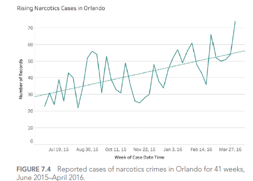
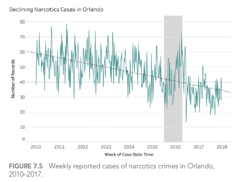
For example, consider this graph showing drug-related crime cases in Orlando:


This graph seems to show an alarming increase in drug-related crimes. However, upon closer examination, we see that the Y-axis doesn’t start at zero, visually exaggerating the increase.
Pitfall 6B: Data Dogmatism
It’s easy to fall into the trap of data dogmatism, thinking there’s only one « right » way to visualize data. In reality, the choice of graph type depends on the context, audience, and message you want to convey.
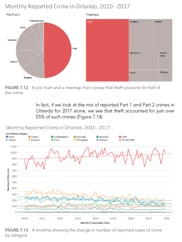
For example, although pie charts are often criticized, they can be effective for showing parts of a whole, especially when there are few categories:

This pie chart clearly shows that theft accounts for nearly half of all reported crimes in Orlando.
Pitfall 6C: The false optimization/satisfaction dichotomy
In data visualization, one can fall into the trap of thinking that we must always seek the « optimal » visualization at the expense of « satisfactory » solutions. In reality, it’s often more practical and effective to find a visualization that meets the needs sufficiently well, rather than spending excessive time seeking perfection.
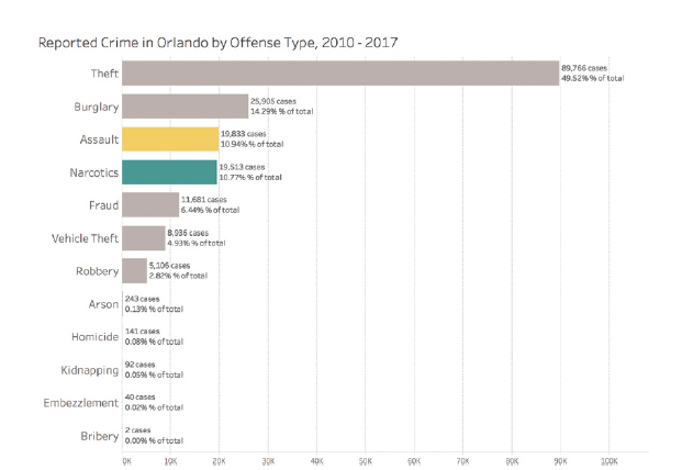
For example, this horizontal bar chart can be « satisfactory » for showing the most common types of crimes, even if it’s not necessarily « optimal »:

This graph is easy to understand and quickly provides essential information, even if it could potentially be optimized further.
CONCLUSION
In this article, we explored the sixth type of error we can encounter when working with data: graphical gaffes. We’ve seen how to avoid misleading graphs, data dogmatism, and the false dichotomy between optimization and satisfaction.
In the next and final article in our series, we’ll explore the 7th type of error: design dangers. We’ll see how design choices can affect the perception and interpretation of visualized data.
This series of articles is strongly inspired by the book « Avoiding Data Pitfalls – How to Steer Clear of Common Blunders When Working with Data and Presenting Analysis and Visualizations » written by Ben Jones, Founder and CEO of Data Literacy, WILEY edition. We highly recommend this excellent read to deepen your understanding of data-related pitfalls and how to avoid them!
You can find all the topics covered in this series here: https://www.businesslab.mu/blog/artificial-intelligence/data-7-pitfalls-to-avoid-the-introduction/
