We’ve all expressed disbelief at the relevance of mathematics to our daily lives. What purpose could this dense, complex subject possibly serve? Well, in a world where data is everywhere and infuses every strategic decision made by organizations, mathematics is vitally important (editor’s note: it always has been!).
In our data analysis projects, mathematical errors can occur as soon as a calculated field is created to generate additional information from our initial dataset. This type of error can be found, for example, when :
- We perform aggregations (sum, mean, median, minimum, maximum, count, separate count etc.) at different levels of detail
- We make divisions to produce ratios or percentages
- We work with different units
These are obviously just a few of the types of operation where errors can occur. But in our experience, these are the main causes of the problems we encounter.
And, in each of these cases, it doesn’t take a genius engineer or scientist to correct them. It just takes a little care and a lot of rigor!
1. Unit processing errors
In this article, we won’t dwell too much on this common mistake. In fact, there are a large number of articles and anecdotes which illustrate this type of problem perfectly and in detail (which we also discussed in the previous article).
The most famous and costly example is the crash of the Mars Orbiter probe. If you’d like to find out more, please click here: Mars Climate Orbiter – Wikipedia
You may argue that none of us is part of NASA and has to land a probe on a distant planet, so we’re not concerned. Well, you may well come across this type of error when handling time data (hours, days, seconds, minutes, years), financial data (different currencies), or managing stocks (units, kilos, pallets, bars etc.).

2. Aggravation of aggregations
We aggregate data when we group records that have an attribute in common. There are all sorts of such groupings that we deal with in our world as soon as we can establish hierarchical links; time (day, week, month, year), geography (cities, region, country), organizations (employees, teams, companies) and so on.
Aggregations are a powerful tool for apprehending the world, but beware, they involve several risk factors:
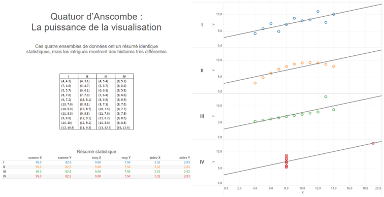
- Aggregations summarize a situation and do not present detailed information. Anyone who has taken part in a datavisualization training course with our teams is familiar with Anscombe’s quarter:

The statistical summary is a typical example of what aggregates can hide. In this example, the four data sets have exactly the same sums, means and standard deviations on both coordinates (X,Y). When we plot each of the points on curves, it’s easy to see that the 4 stories are significantly different.
As soon as data is aggregated, we try to summarize a situation. We must always remember that this summary masks the details and context that explain it. So be careful when, in a discussion, your interlocutors only talk about average values, sums or medians, without going into the details of what may have led to that particular scenario.
- Aggregations can also mask missing values and be misleading. Indeed, depending on the way we represent information, the fact that data is missing may not be clearly visible at first glance.
Take, for example, a dataset in which we observe the number of bird strikes on aircraft for an airline.
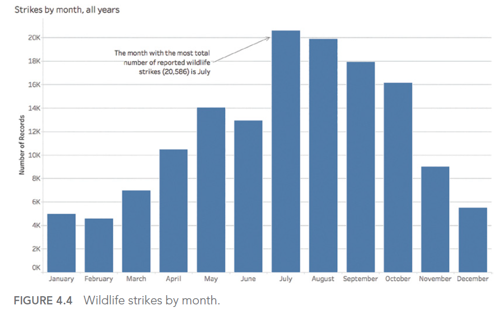
Our objective is to determine the month(s) of the year with the most incidents. This gives :

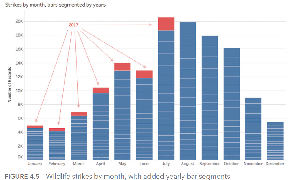
July appears to be the month with the highest number of impacts counted. However, if we look at the details by year, we realize that the aggregation chosen to answer our question did not allow us to determine that the seizures for the year 2017 stopped during this famous month of July:

The answer to our question was therefore August, if we exclude the data for the year for which we didn’t have all the records.
- Totals and aggregations :
This is the last example of the problems linked to aggregations that we’re going to discover in this article. This is one of the author’s “favorite” mistakes. Some might even call it a specialty!
It comes into play when it’s necessary to count the distinct individuals in a given population. Let’s say we’re looking at our customer base and want to know how many unique individuals are in it.
Counting the distinct ids for the whole company gives us a count of our unique customers:

But if we look at each product line and display a sum without paying attention :

We found 7 more customers!
This happens simply because there are customers in the customer base of the company studied who take both services AND licenses, and who end up being counted twice in the total!
This is a problem with simple solutions in all modern datavisualization and BI software, but it tends to hide itself in a series of calculations and aggregations, causing sometimes surprising discrepancies at the end of the chain.
3. Panic on board, a ratio!
We’ll illustrate this point with an example taken from one of the dashboards we made for one of our customers. With all our expertise, we also sometimes jump headlong into this type of error:

And yes, we’re talking about an occupancy rate that’s “slightly” over 100%!
How is this possible? A simple oversight!
The sum of the divisions is not equal to the division of the sums…
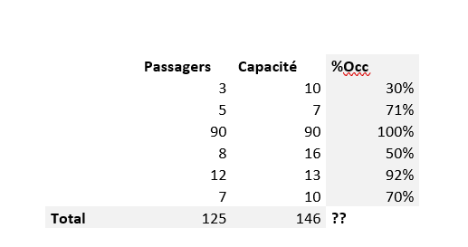
In this case, we had a data set similar to the one below:

Is the occupancy rate equal to :
The sum of the individual occupancy rates? FALSE!
This gives us a total of 30% + 71% + 100% + 50% + 92% + 70%, i.e. 414%.
And that’s exactly the error we made on an even larger data set…
Or the ratio of total passengers to total available capacity? 125/146 = 86%. That’s more accurate!
Note: the average of individual occupancy rates would also be wrong.
In short, whenever a ratio is manipulated, it’s a question of dividing the total of the numerator and denominator values to avoid this type of problem.
This is just one example of a ratio error. Honorable mentions can be given to the treatment of NULL values in a calculation, or to the comparison of ratios that are not calculated with the same denominators.
In the next article, we’ll explore the 4th type of obstacle we may encounter when using data to shed light on the world around us:
Statistical slippage. (Spoilers: “There are lies, damned lies and statistics” B.Disraeli)
This article was strongly inspired by the book “Avoiding Data pitfalls – How to steer clear of common blunders when working with Data and presenting Analysis and visualization” written by Ben Jones, Founder and CEO of Data Litercy, WILEY edition. We recommend this excellent read!
You can find all the topics covered in this series here: https://www.businesslab.mu/blog/artificial-intelligence/data-7-pitfalls-to-avoid-ep-2-7-technical-errors-how-is-data-created/
