Data Regulations

Business Intelligence, Data Governance, Data Marketing, Data Mining and Data Integration, Data Quality Management, Data Regulations, Data visualisation, Machine Learning, Self-service Analytics

DATA: 7 Pitfalls to Avoid, Ep 5/7 – Analytical aberrations

Intuition and Analysis are Not Mutually Exclusive

In our quest to make the most of data, we often fall into the trap of considering intuition and analysis as mutually exclusive approaches. However, as we’ll see in this episode on analytical aberrations, intuition plays a crucial role in the data analysis process.

Pitfall 5A: the False Intuition/Analysis Dichotomy

There was a time when advertisements boasted about moving from intuition to analysis in decision-making. This view is mistaken. Intuition isn’t obsolete in the data age – it’s actually more valuable than ever.

Intuition is the spark that powers the engine of analysis. It helps us:

  1. Know WHY the data is important
  2. Understand WHAT the data is telling us (and isn’t telling us)
  3. Know WHERE to look next
  4. Know WHEN to stop analyzing and take action
  5. Know WHO needs to hear the results and HOW to communicate them

Pitfall 5B: Exuberant Extrapolations

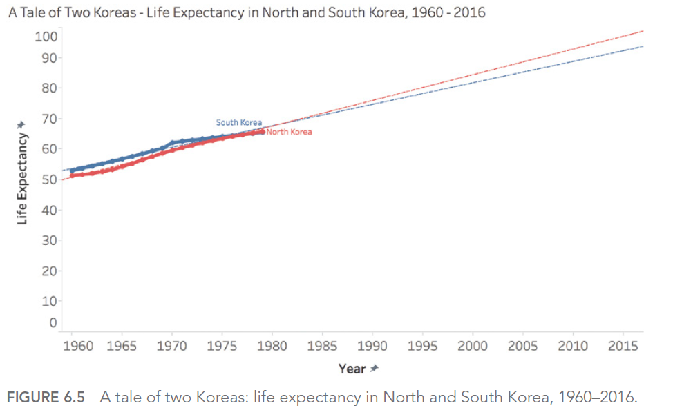
Predicting the future from data can be risky. Extrapolating current trends can lead to significant errors if we don’t account for natural limits or potential changes.

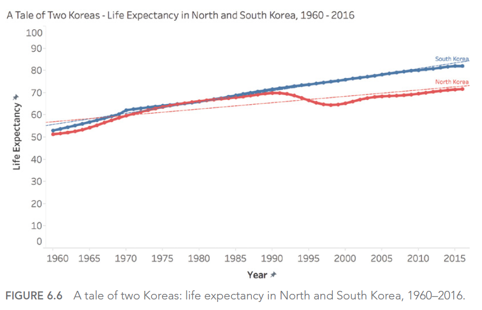
For example, if we look at life expectancy in North and South Korea from 1960 to 1980, we might be tempted to predict a continuous, linear increase. However, reality turned out quite differently, especially for North Korea, which experienced a significant decline in the 1990s.

Pitfall 5C: Ill-Advised Interpolations

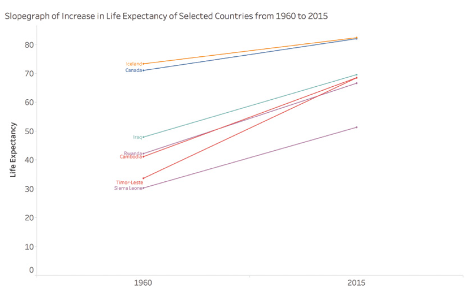
When working with time-series data, we must be careful in our interpretations between data points. A simple slope graph connecting two points in time can mask significant fluctuations between these points.

For example, consider life expectancy in certain countries between 1960 and 2015. A simple slope graph showing the change between these two years could give the impression of a steady and constant increase. However, this simplified representation would mask periods of conflict, economic hardship, or rapid progress in public health that significantly impacted life expectancy over the years.

Take the case of Cambodia, Timor-Leste, Sierra Leone, and Rwanda. A simple slope graph would show an increase in life expectancy between 1960 and 2015, but would completely obscure the tragic periods of war and genocide these countries experienced. For instance, life expectancy in Cambodia fell to less than 20 years in 1977 and 1978, a crucial fact that would be completely ignored in a simple interpolation between 1960 and 2015.

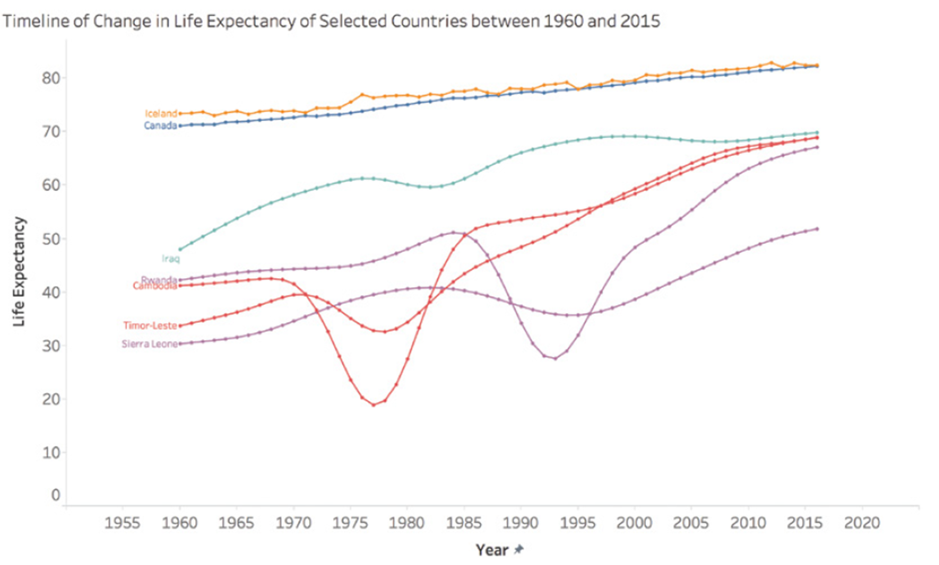
This graph shows the actual evolution of life expectancy in these countries, revealing the dramatic fluctuations masked by a simple linear interpolation.

Pitfall 5D: Funky Forecasts

Forecasts, especially long-term ones, can be particularly prone to errors. A striking example is the unemployment forecasts made by different U.S. presidential administrations. These forecasts tend to show a rapid return to a « normal » rate of 4-6%, regardless of the actual economic situation.

This phenomenon can be explained by several factors. First, there’s political pressure to present optimistic outlooks. Second, there’s a natural tendency to assume that extreme or unusual situations will correct themselves quickly. Finally, forecasting models are often based on historical data and may not adequately account for structural changes in the economy.

For example, during the 2008 financial crisis, unemployment forecasts made just before or at the beginning of the crisis failed to anticipate the magnitude and duration of the increase in unemployment. Similarly, forecasts made at the height of the crisis often underestimated the time it would take for the unemployment rate to return to pre-crisis levels.

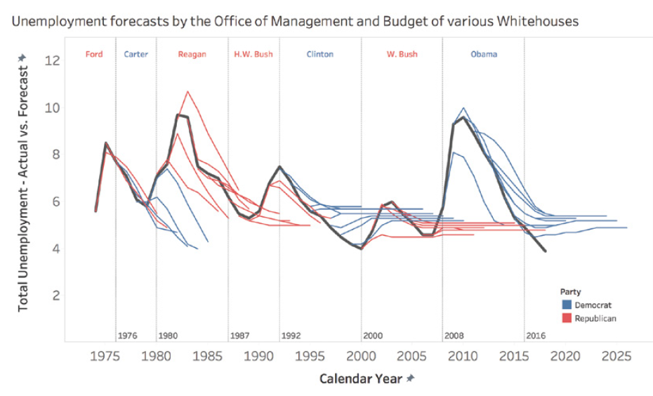
This graph shows how different presidential administrations have consistently predicted a rapid return to a « normal » unemployment rate, even in the face of very different economic realities.

Pitfall 5E: Moronic Measures

It’s crucial to ensure that the measures we use are relevant and meaningful. Too often, we focus on measures that are easy to obtain rather than those that are truly important for understanding a phenomenon or making decisions.

In sports, for example, many traditional measures can be misleading. Take the case of professional basketball: a player’s average speed on the court might seem like an interesting measure, but it doesn’t necessarily reflect the player’s real impact on the game.

LeBron James, one of the best players of all time, was criticized during the 2018 playoffs for having the lowest average speed on the court. However, this measure didn’t account for his real impact on the game, measured by more relevant statistics like the Player Impact Estimate (PIE).

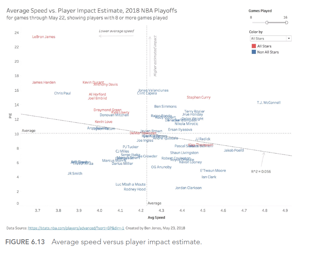
This graph shows the relationship between average speed and PIE for NBA players. We can see that LeBron James (point in the top left) has a very high PIE despite a relatively low average speed, illustrating why average speed alone is an inadequate measure of a player’s performance.

This case illustrates the importance of choosing measures that truly reflect what we’re trying to evaluate, rather than settling for measures that are easy to obtain but potentially misleading.

In this article, we explored the fifth type of error we can encounter when using data to illuminate the world around us: analytical aberrations. We’ve seen how intuition and analysis can work together, and how to avoid the pitfalls of exuberant extrapolations, ill-advised interpolations, funky forecasts, and moronic measures.

In the next article, we’ll explore the 6th type of error in our series: graphical gaffes. We’ll see how errors in data visualization can lead to misinterpretations and poorly informed decisions.

This series of articles is strongly inspired by the book « Avoiding Data Pitfalls – How to Steer Clear of Common Blunders When Working with Data and Presenting Analysis and Visualizations » written by Ben Jones, Founder and CEO of Data Literacy, WILEY edition. We highly recommend this excellent read to deepen your understanding of data-related pitfalls and how to avoid them!

You can find all the topics covered in this series here: https://www.businesslab.mu/blog/artificial-intelligence/data-7-pitfalls-to-avoid-the-introduction/

Artificial Intelligence, Business Intelligence, Data Governance, Data Marketing, Data Mining and Data Integration, Data Quality Management, Data Regulations, Data visualisation, Machine Learning, Self-service Analytics

DATA: 7 pitfalls to avoid, Ep 4/7 – Statistical errors – Facts are stubborn things, but statistics are malleable

“There are lies, damned lies and statistics” B.Disraeli


Why such distaste for a field that, according to Webster’s Merriam-dictionary, is simply “a branch of mathematics dealing with the collection, analysis, interpretation and presentation of masses of numerical data. ”1 Why is the field of statistics in such a negative light by so many people?

There are four main reasons

  • It’s a complex field. Even the basic concepts are not easily accessible and are very difficult to explain.
  • Even the best-intentioned experts can misapply the tools at their disposal.
  • The third reason behind all this hatred is that those with an agenda can easily create statistics to lie about when communicating with us.
  • The final reason is that statistics can often seem cold and distant, making them very difficult for the public to grasp.

Descriptive setbacks

Descriptive statistics are intended to summarize the main characteristics of a data set. However, incorrect or inappropriate use can lead to misleading conclusions. A typical example is the use of the mean to summarize a distribution, without taking into account variability or skewness. Another common error is to present percentages without explaining the total number of people, which can be misleading as to the true extent of a phenomenon. It is therefore crucial to understand the assumptions and limitations of each descriptive measure in order to use it correctly.

Let’s take the example of analyzing salaries within a company. If we simply look at average salaries, we might conclude that the company is paying its employees well. However, if management salaries are very high compared to the rest of the employees, the average would be biased upwards. It would be more relevant to use the median, which gives the salary in the middle, or to look at the complete salary distribution for a more accurate view.

This error is very well described here with cats:

Inferential fires

Always a feline explanation:

Statistical inference aims to draw conclusions about a population from a sample of that population. However, this process is subject to error. Sampling errors and Type I and II errors are common. In addition, errors can be exacerbated by confusion between correlation and causation. A solid understanding of the principles of statistical inference is essential to avoid these pitfalls.

Let’s imagine a public health study seeking to establish a link between a particular dietary habit (such as eating organic) and better overall health. If the study finds a positive correlation, it doesn’t necessarily mean that eating organic causes better health. There could be confounding factors, such as income level or lifestyle, that influence both eating habits and health status. Here, we can fall into the trap of confusing correlation with causation.

Sliding sampling

Sampling is a crucial stage in any data collection process. Yet many errors can occur at this stage. The sample may not be representative of the target population, due to selection bias or non-response. What’s more, the sample size may be insufficient to detect an effect. Careful sample planning is therefore essential to obtain reliable results.

Consider a customer satisfaction survey conducted by an e-commerce company. If the company only solicits opinions from customers who have made a recent purchase, it runs the risk of obtaining a distorted picture of overall customer satisfaction. Indeed, dissatisfied customers may have stopped making purchases and therefore not be included in the sample. This is an example of selection bias.

Insensitivity to sample size

A common mistake in data analysis is to ignore the impact of sample size on results. A large sample size can make a very small effect significant, while too small a sample size may not have sufficient power to detect an existing effect. Furthermore, statistical significance does not necessarily mean practical significance. So it’s important to consider sample size when interpreting results.

Suppose you’re conducting a study to assess the effect of a drug on lowering blood pressure. If you have a very large sample of patients, you may see a statistically significant drop in blood pressure. However, this drop may be very small, say 0.1 mm Hg, a clinically insignificant value despite its statistical significance. This is an example where sample size can make a small effect significant. On the other hand, if the sample is too small, a real effect may be missed. It is therefore important to consider clinical or practical significance in addition to statistical significance.

Digging deeper into this issue, Ben Jones (see author who inspired this article) managed to find figures on kidney cancer rates as well as demographics for every US county, and he created an interactive dashboard (figure below) to visually illustrate the fact that Kahneman, Wainer and Zwerlink are doing quite clearly in words.

Notice a few elements in the dashboard. On the choropleth map (filled in), the darkest orange counties (high rates relative to the overall U.S. rate) and the darkest blue counties (low rates relative to the overall U.S. rate) are often side by side.

Also, note how in the scatterplot below the map, the marks form a funnel shape, with less populated counties (on the left) more likely to deviate from the reference line (the overall U.S. rate), and more populated counties like Chicago, L.A. and New York are more likely to be close to the overall reference line.


One final observation: if you hover over a county with a small population in the interactive online version, you’ll notice that the average number of cases per year is extremely low, sometimes 4 cases or less. A small deviation – even just 1 or 2 cases – in a subsequent year will pull a county from the bottom of the list to the top, or vice versa.


In the next article, we’ll explore the 5th type of error we may encounter when using data to illuminate the world around us: Analytical aberrations.

This article is heavily inspired by the book “Avoiding Data pitfalls – How to steer clear of common blunders when working with Data and presenting Analysis and visualization” written by Ben Jones, Founder and CEO of Data Litercy, WILEY edition. We recommend this excellent read!

You can find all the topics covered in this series here: https://www.businesslab.mu/blog/artificial-intelligence/data-7-pitfalls-to-avoid-the-introduction/

Business Intelligence, Data Governance, Data Marketing, Data Mining and Data Integration, Data Regulations, Machine Learning, Self-service Analytics, Technology

DATA: 7 pitfalls to avoid. Ep 3/7 – Mathematical errors: how are data calculated?

We’ve all expressed disbelief at the relevance of mathematics to our daily lives. What purpose could this dense, complex subject possibly serve? Well, in a world where data is everywhere and infuses every strategic decision made by organizations, mathematics is vitally important (editor’s note: it always has been!).

In our data analysis projects, mathematical errors can occur as soon as a calculated field is created to generate additional information from our initial dataset. This type of error can be found, for example, when :

  • We perform aggregations (sum, mean, median, minimum, maximum, count, separate count etc.) at different levels of detail
  • We make divisions to produce ratios or percentages
  • We work with different units

These are obviously just a few of the types of operation where errors can occur. But in our experience, these are the main causes of the problems we encounter.

And, in each of these cases, it doesn’t take a genius engineer or scientist to correct them. It just takes a little care and a lot of rigor!

1. Unit processing errors

In this article, we won’t dwell too much on this common mistake. In fact, there are a large number of articles and anecdotes which illustrate this type of problem perfectly and in detail (which we also discussed in the previous article).

The most famous and costly example is the crash of the Mars Orbiter probe. If you’d like to find out more, please click here: Mars Climate Orbiter – Wikipedia

You may argue that none of us is part of NASA and has to land a probe on a distant planet, so we’re not concerned. Well, you may well come across this type of error when handling time data (hours, days, seconds, minutes, years), financial data (different currencies), or managing stocks (units, kilos, pallets, bars etc.).

2. Aggravation of aggregations

We aggregate data when we group records that have an attribute in common. There are all sorts of such groupings that we deal with in our world as soon as we can establish hierarchical links; time (day, week, month, year), geography (cities, region, country), organizations (employees, teams, companies) and so on.

Aggregations are a powerful tool for apprehending the world, but beware, they involve several risk factors:

  • Aggregations summarize a situation and do not present detailed information. Anyone who has taken part in a datavisualization training course with our teams is familiar with Anscombe’s quarter:

The statistical summary is a typical example of what aggregates can hide. In this example, the four data sets have exactly the same sums, means and standard deviations on both coordinates (X,Y). When we plot each of the points on curves, it’s easy to see that the 4 stories are significantly different.

As soon as data is aggregated, we try to summarize a situation. We must always remember that this summary masks the details and context that explain it. So be careful when, in a discussion, your interlocutors only talk about average values, sums or medians, without going into the details of what may have led to that particular scenario.

  • Aggregations can also mask missing values and be misleading. Indeed, depending on the way we represent information, the fact that data is missing may not be clearly visible at first glance.

Take, for example, a dataset in which we observe the number of bird strikes on aircraft for an airline.

Our objective is to determine the month(s) of the year with the most incidents. This gives :

July appears to be the month with the highest number of impacts counted. However, if we look at the details by year, we realize that the aggregation chosen to answer our question did not allow us to determine that the seizures for the year 2017 stopped during this famous month of July:

The answer to our question was therefore August, if we exclude the data for the year for which we didn’t have all the records.

  • Totals and aggregations :

This is the last example of the problems linked to aggregations that we’re going to discover in this article. This is one of the author’s “favorite” mistakes. Some might even call it a specialty!

It comes into play when it’s necessary to count the distinct individuals in a given population. Let’s say we’re looking at our customer base and want to know how many unique individuals are in it.

Counting the distinct ids for the whole company gives us a count of our unique customers:

But if we look at each product line and display a sum without paying attention :

We found 7 more customers!

This happens simply because there are customers in the customer base of the company studied who take both services AND licenses, and who end up being counted twice in the total!

This is a problem with simple solutions in all modern datavisualization and BI software, but it tends to hide itself in a series of calculations and aggregations, causing sometimes surprising discrepancies at the end of the chain.

3. Panic on board, a ratio!

We’ll illustrate this point with an example taken from one of the dashboards we made for one of our customers. With all our expertise, we also sometimes jump headlong into this type of error:

And yes, we’re talking about an occupancy rate that’s “slightly” over 100%!

How is this possible? A simple oversight!

The sum of the divisions is not equal to the division of the sums…

In this case, we had a data set similar to the one below:

Is the occupancy rate equal to :

The sum of the individual occupancy rates? FALSE!

This gives us a total of 30% + 71% + 100% + 50% + 92% + 70%, i.e. 414%.

And that’s exactly the error we made on an even larger data set…

Or the ratio of total passengers to total available capacity? 125/146 = 86%. That’s more accurate!

Note: the average of individual occupancy rates would also be wrong.

In short, whenever a ratio is manipulated, it’s a question of dividing the total of the numerator and denominator values to avoid this type of problem.

This is just one example of a ratio error. Honorable mentions can be given to the treatment of NULL values in a calculation, or to the comparison of ratios that are not calculated with the same denominators.

In the next article, we’ll explore the 4th type of obstacle we may encounter when using data to shed light on the world around us:

Statistical slippage. (Spoilers: “There are lies, damned lies and statistics” B.Disraeli)

This article was strongly inspired by the book “Avoiding Data pitfalls – How to steer clear of common blunders when working with Data and presenting Analysis and visualization” written by Ben Jones, Founder and CEO of Data Litercy, WILEY edition. We recommend this excellent read!

You can find all the topics covered in this series here: https://www.businesslab.mu/blog/artificial-intelligence/data-7-pitfalls-to-avoid-ep-2-7-technical-errors-how-is-data-created/

Business Intelligence, Company, CRM, Data Governance, Data Marketing, Data Mining and Data Integration, Data Quality Management, Data Regulations, Machine Learning, Self-service Analytics

DATA: 7 pitfalls to avoid. Ep 2/7 – Technical errors: how is data created?

Having defined a few key data-related concepts, we can now delve into the technical issues that can lead to errors. This article deals with the problems associated with the process of obtaining the data that will subsequently be used. It’s about building the foundations of our analyses.

And it goes without saying that we don’t want to build a house of cards on sand!

To stay with the construction metaphor, if problems of this nature exist, they will be hidden and barely visible in the final building. Particular care must therefore be taken during the data collection, processing and cleaning stages. It’s not for nothing that it’s estimated that 80% of the time spent on a data science project is spent on this type of task.

To avoid falling into this trap, and to limit the load required to carry out these potentially tedious operations, we need to accept three fundamental principles:

  • Virtually all datasets are not clean and need to be cleaned and formatted.
  • Each transition (formatting, join, link, etc.) during the preparation stages is a potential source of new error
  • It is possible to learn techniques to avoid the creation of errors arising from the first two principles.

Accepting these principles does not remove the obligation to go through this preliminary work before any analysis, but the good news is that knowing how to identify these risks, and learning as we go along, helps to limit the scope of this second obstacle.

1. The trap of dirty data.

Data is dirty. I’d even go so far as to say that all data is dirty (see first principle above), with problems of formatting, data entry, inconsistent units, NULL values and so on.

Some well-known examples of this trap

Take the crash of NASA’s Mars Climate Orbiter in 1999, for example. A $125 million error caused by a dual unit system: imperial and metric units. This led to an erroneous calculation that affected the power sent to the probe’s thrusters and its destruction.

Fortunately, not all errors of this nature will cost us so much money! But they do have a significant impact on the results and ROI of the analyses we carry out.

So, at DATANALYSIS, we’re currently running several projects specifically on data quality in the context of DATA Marketing, and we’re dealing with two types of subject:

  • Data validation, which aims to improve data quality through data processing, by :

-Standardizing fields (phone number, email, etc.): +262 692 00 11 22 / 00262692001122 / 06-92-00-11-22 correspond to the same line, and we can automate much of this work thanks to appropriate processing;

– Filling in empty fields using other data in the table. For example, we can deduce the country of residence from telephone numbers, zip codes, cities, etc.


  • Deduplication, by :

-Using adapted rules to identify potentially identical lines. Two records with the same e-mail address, telephone number or company ID;

-Using distance calculation algorithms to define similar values in terms of spelling, pronunciation, common characters, etc.

From these examples and our own experience, we can see that this type of error mainly stems from data entry, collection or “scrapping” processes, whether implemented automatically or by humans. So, in addition to the solutions that can be implemented in data preparation processes, improving these preliminary steps will also greatly improve the quality of the data to be processed, and this requires education, training and the definition of rules and standards that are clearly known and shared (data governance is never far away).

Finally, we should also ask ourselves when we can consider this stage to be sufficiently clean. After all, we can always do more and better, but the costs involved can often outweigh the expected returns.

2. The data transformation trap

In the IT world, there’s an image that sums up this type of problem:

Often, the mistake lies between the screen and the seat!

And yes, even the best data scientists, data analysts or data engineers can make mistakes in the data cleansing, transformation and preparation stages.

Frequently, we manipulate several files from different sources and different applications, which multiplies the risks associated with dirty data issues and the risks when manipulating the files themselves:

  • Different levels of granularity
  • Joins on fields whose values are not exactly identical (e.g. ST-DENIS vs SAINT DENIS).
  • Different file perimeters

And this problem can also be made more complex depending on the tools used in our analyses:

  • In Tableau, for example, we can perform data joins, relations or links to link several datasets together. Each type of operation has its own rules and constraints.
  • In Qlik, you need to understand how the associative engine works and the associated modeling rules, which differ from those of a traditional BI model.

In this case, it’s often a question of technical constraints linked to the very business of data preparation, and taking the time to understand the risks and processes in place will save a great deal of time in delivering reliable, high-performance data analysis.

In the next article, we’ll explore the 3rd type of obstacle we may encounter when using data to shed light on the world around us: Mathematical errors.

This article was strongly inspired by the book “Avoiding Data pitfalls – How to steer clear of common blunders when working with Data and presenting Analysis and visualization” written by Ben Jones, Founder and CEO of Data Litercy, WILEY edition. We recommend this excellent read!

You can find all the topics covered in this series here : https://www.businesslab.mu/blog/artificial-intelligence/data-7-pitfalls-to-avoid-ep-1-7-epistemological-errors-how-do-we-think-about-data/

Artificial Intelligence, Business Intelligence, Company, Data Governance, Data Marketing, Data Mining and Data Integration, Data Quality Management, Data Regulations, Machine Learning

DATA: 7 pitfalls to avoid. Ep 1/7 – Epistemological errors: how do we think about data?

Let’s start by defining what epistemology is.

Epistemology (from the ancient Greek ἐπιστήμη / epistémê “true knowledge, science” and λόγος / lógos “discourse”) is a field of philosophy that can refer to two fields of study: the critical study of science and of scientific knowledge (or scientific work).
In other words, it’s about how we construct our knowledge.

In the world of data, this is a central and critical topic. We are familiar with the process of transforming data into information, knowledge and wisdom:

Here, the problem lies in the way we consider our starting point: data! Indeed, the use of data and its transformation in the following stages are the result of conscious and controlled processes and procedures:

==>I clean up my data, process it in an ETL / ELT, store it, visualize it, communicate my results and share them, and so on. This mastery gives us control over the quality of each step. However, we tend to embark on this work of transforming our primary resource while overlooking a crucial point, the source of our first obstacle:

DATA IS NOT AN EXACT REPRESENTATION OF THE REAL WORLD!

Indeed, it’s all too easy to work with data by thinking of data as reality itself, and not as data collected about reality. This nuance is essential:

It’s not crime, but reported crime
It’s not the diameter of a mechanical part, but the measured diameter of that part.
It’s not public sentiment on a subject, but the declared feeling of those who responded to a survey.

Let’s go into the details of this obstacle with a few examples:

1. What we don't measure (or didn't measure)

Let’s take a look at this dashboard showing all the meteorite impacts on Earth between -2500 and 2012. Can you identify what’s strange here?

Meteorites seem to have carefully avoided certain parts of the planet – a large part of South America, Africa, Russia, Greenland, etc. And if we focus on the graph showing the number of meteorites per year, these have tended to fall more in the last 50 years (and almost not over the whole period covering -2055 to 1975).

Is this really the case? Or rather flaws in the way the data was collected?

  • We have recently begun to systematically collect this information and rely on archaeology to try and determine the impacts of the past. As erosion and time have taken their toll, the traces of the vast majority of impacts have disappeared and can no longer be counted (and no, meteorites didn’t start raining in 1975).
  • For a meteorite impact to be included in a database, it has to be recorded. And to do that, you need an observation, and therefore an observer, who knows who to report it to. These two biases have a major impact on data collection, and help to explain the large areas of the Earth that seem to have been spared by the meteorite fall.

2. Measurement system not working

Sometimes, the cause of this discrepancy between data and reality can be explained by a defect in the collection equipment. Unfortunately, anything manufactured by a human being in this world is liable to fail. This applies to sensors and measuring instruments, of course.

What happened on April 28 and 29, 2014 on this bridge? There seems to have been a huge spike in bicycle traffic across the Fremont Bridge, but only in one direction (blue curve).

Source : 7 datapitfalls – Ben Jones

Time series of the number of bicycles crossing the Fremont Bridge

You’d think it was a beautiful summer’s day and everyone was on the bridge at the same time? That it was a one-way bike race? That everyone who crossed the bridge on the outward journey had a flat tire on the return journey?

More prosaically, it turns out that the blue counter had a fault on those particular days and was no longer counting bridge crossings correctly. A simple change of battery and sensor solved the problem.

Now, ask yourself how many times you’ve been misled by data from a faulty sensor or measurement without being aware of it?

3. Data is too human

And yes, our own human biases have a major effect on the values we record when gathering information. We tend, for example, to round off measurement results:

Source : 7 datapitfalls – Ben Jones

If we go by his data, diaper changes take place more regularly every 10 minutes (0, 10, 20, 30, 40, 50) and sometimes over certain quarters of an hour (15, 45). Wouldn’t that be incredible?

It is an incredible story. In fact, we need to look at how the data was collected. As human beings, we have this tendency to round up information when we record it, especially when we look at a watch or clock: why not indicate 1:05 when it’s 1:04? Or even simpler, 1:00, because it’s even simpler?

4. The Black Swan!

The final example we’d like to highlight here is the so-called “Black Swan” effect. If we think that the data we have at our disposal is an accurate representation of the world around us, and that we can extract from it assertions to be set in stone; then we are fundamentally mistaken about what data is (see above).

The best use of data is to learn what isn’t true from a preconceived idea, and to guide us in the questions we need to ask ourselves to learn more?

But back to our black swan:

Before the discovery of Australia, every swan sighting ever made could confirm to Europeans that all swans were white – wrong! In 1697, the sighting of a black swan completely challenged this common preconception.

And the link with the data? In the same way that we tend to believe that a repeated observation is a general truth – wrongly so – we can be led to infer that what we see in the data we manipulate can be applied generally to the world around us and to any era. This is a fundamental error in the appreciation of data.

5. How to avoid epistemological error?

All it takes is a little mental gymnastics and a little curiosity:

  • Clearly understand how measurements are defined
  • Understand and represent the data collection process
  • Identify possible limitations and measurement errors in the data used
  • Identify changes in measurement methods and tools over time
  • Understand the motivations of data collectors

In the next article, we’ll explore the 2nd type of obstacle we may encounter when using data to illuminate the world around us: Technical Mistakes.

This article is heavily inspired by the book “Avoiding Data pitfalls – How to steer clear of common blunders when working with Data and presenting Analysis and visualization” written by Ben Jones, Founder and CEO of Data Litercy, WILEY edition. We recommend this excellent read!

You can find all the topics covered in this series here : https://www.businesslab.mu/blog/artificial-intelligence/data-7-pitfalls-to-avoid-the-introduction/

Business Intelligence, Data Governance, Data Marketing, Data Mining and Data Integration, Data Quality Management, Data Regulations, Data Warehouse

DATA: 7 pitfalls to avoid. The introduction.

DATA! DATA ! DATA everywhere!

These days, data is everywhere, featuring prominently in all new projects and corporate strategies. It’s the key to performance in these uncertain times. At Business Lab consulting, we’re the first to be convinced that it’s a powerful tool that accelerates performance…when it’s well used, well understood and well mastered!

In this new series of articles, we’re going to talk about the big bad wolf; the devil that hides in the detail (or sometimes reveals itself in broad daylight) and discuss with you the 7 main types of pitfalls posed by data and its use. As far as possible, we’ll try to illustrate them with an example from our own experience, because as experts we’ve had the good fortune to come up against each of them in our missions…

Note: these are the pitfalls discussed in Ben Jones’ book, “7 data pitfalls”, which we highly recommend!

Enough suspense, let’s now unveil the 7 families of DATA deadly sins that we’ll be exploring in greater detail over the next 7 weeks:

1. Epistemological errors: how do we think about data?

We often use data with the wrong frame of mind, or with erroneous preconceptions. So, if we go into an analysis project thinking that the data is a perfect representation of reality; if we draw definitive conclusions based on predictions without questioning them; or if we look in the available information for anything that might confirm an opinion already made; then we can create critical errors in the very foundations of these projects.

2. Technical errors: how are the data processed?

Technical and technological issues are often a major source of error in the world of data. Once you’ve identified the information you need, there’s a whole series of obstacles to overcome. Are my sensors working? Do my processes not generate duplicates? Is my data clean or up to date? Complex issues in our projects! After all, isn’t it said that a data analyst spends most of his time and energy preparing and cleaning his data?

3. Mathematical errors: how are the data calculated?

So now you know what your math lessons from school, college and high school are all about! There’s something for every level and taste! If you’ve never combined data at different levels of detail, or made mistakes when calculating ratios, or forgotten that you shouldn’t mix carrots and bananas, we’d love to hear from you!

4. Statistical errors: how are data related?

As the saying goes, “There are lies, damned lies and statistics”. This is the most complex trap to get to grips with, because it takes a lot of skill to fully understand what’s at stake. However, in a world where machine learning, datamining and AI are king, it’s a family of errors that’s only becoming more common!

Do the measures of central tendency or variation we use lead us astray? Are the samples we work with representative of the population we want to study? Are our comparison tools valid and statistically significant?

5. Analytical aberrations: how are the data analyzed?

So now you know what your math lessons from school, college and high school are all about! There’s something for every level and taste! If you’ve never combined data at different levels of detail, or made mistakes when calculating ratios, or forgotten that you shouldn’t mix carrots and bananas, we’d love to hear from you!

Golden rule: we’re all analysts (whether we have that title or not).

As soon as we use data to make decisions, then we are analysts, and therefore prone to making decisions based on aberrant analyses. For example, are you familiar with vanity metrics? Or have you ever made extrapolations that don’t make sense in the light of the data used?

These last two topics will be even more important to us than the previous ones, because we’re gaga for Data Visualization, so we’ve got plenty of examples of graphical blunders and aesthetic missteps!

6. Graphic blunders: how are data visualized?

Unlike statistical errors or analytical aberrations, graphical blunders are well known and easily identifiable. Why? Because they can be seen (often from a distance). Have we chosen the right type of chart for our analysis? Is the effect I want to show clearly visible?

7. Aesthetic hazards: can beauty be the enemy of goodness?

What’s the difference with graphic blunders?

Here we’re talking about the overall design of the final product and the interactions we’ve defined within it to ensure that the audience we’re trying to convince has the most ergonomic and aesthetically pleasing experience possible! Does the choice of colors we’ve made confuse or simplify the analysis? Have we used our creativity to make our dashboards pleasing to the eye, and have we used aesthetics to bring impact to the analysis we’re making? Is the final product easy to use and ergonomic, or are the interactions complex and time-consuming?

Are you ready to follow us through the twists and turns of everything that can go wrong with your data analysis projects, so that you don’t fall into these traps?

See you next week!

Did this article inspire you?
Business Intelligence, Company, Data Governance, Data Marketing, Data Mining and Data Integration, Data Quality Management, Data Regulations, Data Warehouse, Machine Learning, Self-service Analytics, Technology

Getting started with Business Intelligence: practical tips

« Wisdom is about extracting gold from raw data; with sharp Business Intelligence, every piece of information becomes a nugget. »

This adage perfectly sums up the potential of BI, provided you follow a few practical tips. Existing information goldmines allow companies to turn them into nuggets of gold shaped in their own image.

Definition

Business Intelligence (BI) is a set of processes, technologies and tools used to collect, analyse, interpret and present data in order to provide actionable information to an organisation’s decision-makers and stakeholders. The main objective of BI is to help companies make strategic decisions based on reliable and relevant data.

BI is widely used in many areas of business, such as financial management, human resources management, marketing, sales, logistics and supply chain, among others. In short, Business Intelligence aims to transform data into actionable knowledge to improve an organisation’s overall performance.

Before looking at the practical tips, let’s look at the elements that define BI. To put BI into practice within your business, there are 5 main steps you need to follow to achieve relevant and effective BI.

Data collection

Data is collected from a variety of sources inside and outside the company, such as transactional databases, business applications, social media, customer surveys, etc.

Data cleansing and transformation 

The data collected is cleaned, normalised and transformed into a format that is compatible for analysis. This often involves eliminating duplicates, correcting errors and standardising data formats.

Data analysis

Data is analysed using various techniques such as statistical analysis, data mining, predictive models and machine learning algorithms to identify trends, patterns and insights.

Data visualisation

The results of analysis are generally presented in the form of dashboards, reports, graphs and other interactive visualisations to facilitate understanding and decision-making.

Informations dissemination

The information obtained is shared with decision-makers and stakeholders throughout the organisation, enabling them to make informed decisions based on reliable data.

Practical tips

Now that we have a broad understanding of the definition of BI, it’s important to remember that getting started with Business Intelligence (BI) can be a challenge, but with a strategic approach and some practical advice, you can put in place an effective infrastructure for your business.
Here are some practical tips for getting started with relevant and effective Business Intelligence.

Clarify your objectives

Before you start implementing BI, clearly identify the business objectives you want to achieve. Whether you want to improve decision-making, optimise business processes or better understand your customers, clear objectives will help you focus your efforts.

Start with the basics

Don’t try to do everything at once. Start with pilot projects or specific initiatives to familiarise yourself with BI concepts and tools. This will also enable you to measure results quickly and adjust accordingly.

Identify your data sources

Identify your organisation’s internal and external data sources. This can include transactional databases, spreadsheets, CRM systems, online marketing tools, etc. Ensure that the data you collect is reliable, complete and relevant to your objectives.

Clean and prepare your data

Data quality is essential for effective BI. Put processes in place to clean, standardise and prepare your data before analysing it. This often involves eliminating duplicates, correcting errors and standardising data formats.

Choose the right tools

There are many BI solutions on the market, so look for those that best suit your needs. Considers factors such as ease of use, the ability to manage large sets of data, integration with your existing systems and cost.

Train your team

Make sure your team is formed to use BI tools and interpretation of data. BI is a powerful tool, but its effectiveness depends on the ability of your team to use it properly.

Communicate and collaborate

Involve stakeholders from the start of the BI implementation process. Their support and comments will be essential to ensure the long-term success of your initiative BI.

Start small and grow

Don’t try to implement all BI functionalities at once. Start with pilot projects or specific initiatives, and then gradually extend your use of BI according to the results obtained.

Involve stakeholders

Involve stakeholders right from the start of the BI implementation process. Their support and feedback will be essential in ensuring the long-term success of your BI initiative.

Measure and adjust

Track the performance of your BI and measure its impact on your business. Use this information to identify areas for improvement and make adjustments to your BI strategy over time.

By following these initial practical tips, you can get off to a good start with Business Intelligence and start leveraging your data to make informed decisions and drive business growth.

CONCLUSION

A Business Intelligence (BI) project is considered successful when it succeeds in adding value to the business by meeting its business objectives effectively and efficiently. Here are some key indicators that can define a successful BI project:

Alignment with business objectives: the BI project must be aligned with the company’s strategic objectives. It must contribute to improving decision-making, optimising business processes, increasing profitability or strengthening the company’s competitiveness.

Effective use of data: a successful BI project makes effective use of data to provide usable information. This means collecting, cleansing, analysing and presenting data in the right way to meet business needs.

User adoption: end-users must adopt BI tools and use them on a regular basis to make decisions. A successful BI project is one that meets users’ needs and is easy to use and understand.

Improved performance: a successful BI project translates into improved business performance. This can take the form of increased sales, reduced costs, improved productivity or any other performance measure relevant to the business.

Positive return on investment (ROI): a successful BI project generates a positive return on investment for the business. This means that the benefits gained from using BI outweigh the costs of implementing and maintaining the project.

Scalability and flexibility: a successful BI project is capable of adapting to the changing needs of the business and evolving with it. It must be flexible enough to support new needs, new types of data or new usage scenarios.

Management support and commitment: a successful BI project benefits from the support and commitment of the company’s management. Management must recognise the value of BI and provide the necessary resources to support the project throughout its lifecycle.

In summary, a successful BI project is one that contributes to achieving the company’s business objectives by effectively using data to make informed decisions. It is characterised by its alignment with business objectives, its adoption by users, its positive impact on business performance and its positive return on investment.

Did this article inspire you ?
Business Intelligence, Company, Data Governance, Data Marketing, Data Mining and Data Integration, Data Quality Management, Data Regulations, Data Warehouse, Machine Learning, Technology

Basic SQL : what is it?

For a very long time, SQL was reserved for knowledgeable and technical people in the IT department, and not just any company entity or department could do it. It used to be the exclusive preserve of the company’s IT department. Now, with the spread of « IT », many departments are able to access their company’s data using SQL to query their databases, including marketing, accounting, management control, human resources and many others!

Are you a company specialising in e-commerce, healthcare, retail or simply an SME / SMI? Do you have a set of data stored in a database?

It’s essential to know the basics of structured query language (SQL) so that you can quickly get answers to your queries.

DEFINITION

SQL, or Structured Query Language, is a programming language specially designed for managing and manipulating relational databases.

It provides a standardised interface enabling users to communicate with databases and carry out operations such as inserting, updating, deleting and retrieving data efficiently.

THE BASICS OF SQL

Remember that SQL is nothing more than a way of reading the contents of a relational database to retrieve the information a user needs to meet a requirement.

DATA STRUCTURING

SQL is based on the relational model, which organises data in the form of tables. Each table is made up of columns (fields) representing specific attributes, and rows containing the records.

Table structure :

In the world of SQL, table structure is crucial. Each table is defined by columns, where each column represents a particular attribute of the data you are storing. For example, an « employees » table might have columns such as « surname« , « first name« , « age« , etc. These tables are linked by keys. These tables are linked by keys, which can be unique identifiers for each record, facilitating relationships between different tables.

The main operations (or commands / basic SQL queries)

SELECT : Used to extract data from one or more tables. The SELECT clause is used to specify the columns to be retrieved, the filter conditions and the sort order. This clause is one of the most fundamental in SQL. The WHERE clause, often used with SELECT, is used to filter the results according to specific conditions. For example, you might want to retrieve only those employees whose age is greater than 30, or as in the example below, only those employees in the sales department.

SELECT last name, first name FROM employees WHERE department = ‘Sales’;

INSERT: Used to add new rows to a table

INSERT INTO customers (last name, first name, email) VALUES (‘Doe’, ‘John’, ‘john.doe@email.com’);

UPDATE: Used to add new rows to a table

UPDATE products SET price = price * 1.1 WHERE category = ‘Electronics’;

DELETE: Used to delete rows from a table under certain conditions

DELETE FROM orders WHERE order_date < ‘2023-01-01‘;

Filtering and sorting

To filter the results, SQL uses the WHERE clause, which allows you to specify conditions for selecting the data. In addition, the ORDER BY clause is used to sort the results according to one or more columns.

Filtering and sorting are essential operations in the SQL language, making it possible to retrieve specific data and organise it in a meaningful way. Let’s explore these concepts with some practical examples

Filtering with the WHERE clause

The WHERE clause is used to filter the results of a query by specifying conditions. This allows you to select only the data that meets these criteria.

–Select employees with a salary greater than 50000

SELECT last name, first name, salary

FROM employees

WHERE salary > 50000;

In this example, only employees with a salary greater than 50000 will be included in the results.

Filtering with the ORDER BY clause

The ORDER BY clause is used to sort the results of a query according to one or more columns. You can specify the sort order (ascending or descending)

–Select customers and sort alphabetically by name

SELECT last name, first name, email

FROM customers

ORDER BY name ASC;

In this example, the results will be sorted in ascending alphabetical order by customer name.

Filtering and sorting can also be combined, i.e. combining the WHERE clause and the ORDER BY clause to filter the results at the same time

–Select products in the ‘Electronics’ category and sort by descending price

SELECT product_name, price

FROM products

WHERE category = ‘Electronics

ORDER BY price DESC;

There are other ways of filtering and sorting with operators, but this becomes SQL that is no longer basic, but for a more experienced audience.

By understanding these filtering and sorting concepts, you will be able to extract specific data from your SQL databases in a targeted and organised way.

Joins

Joins are essential for combining data from several tables.

Common types of joins include INNER JOIN, LEFT JOIN, RIGHT JOIN and FULL JOIN, each offering specific methods for associating rows between different tables.

Example of a simple join:

SELECT customer.name, orders.date

FROM customers

INNER JOIN orders ON customers.customer_id = orders.customer_id;

Types of joins :

INNER JOIN: Returns the rows when the join condition is true in both tables.

LEFT JOIN (or LEFT OUTER JOIN): Returns all the rows in the left-hand table and the corresponding rows in the right-hand table.

RIGHT JOIN (or RIGHT OUTER JOIN): The opposite of LEFT JOIN.

FULL JOIN (or FULL OUTER JOIN): Returns all rows when the join condition is true in one of the two tables.

Constraints for data integrity and Indexes to optimise performance

Constraints play a crucial role in guaranteeing data integrity. Primary keys ensure that each record in a table is unique, while foreign keys establish links between different tables. Uniqueness constraints ensure that no duplicate values are allowed in a specified column.

Indexes are data structures that improve query performance by speeding up data searches. Creating an index on a column makes searching easier, but it is essential to use them wisely, as they can also increase the size of the database.

Conclusion

SQL is a powerful and universal tool for working with relational databases. Understanding its fundamentals enables developers and data analysts to interact effectively with database management systems, making it easier to manipulate and retrieve crucial information. Whether for simple tasks or more complex operations, SQL remains an essential part of data management.

It offers a range of tools for interacting with relational databases in a powerful and flexible way. By understanding these basic concepts, you’ll be better equipped to effectively manipulate data, create custom reports and answer complex questions from large datasets. Whether you’re a developer, data analyst or database administrator, mastering SQL is an invaluable asset in the world of data management.

Did this article inspire you ?
Business Intelligence, Company, Data Governance, Data Marketing, Data Mining and Data Integration, Data Quality Management, Data Regulations, Data Warehouse, Machine Learning, Self-service Analytics, Technology

Data Warehouses vs Data Lakes: a comparative dive into the Tech World

In the ever-evolving world of technology, two terms have been making waves: Data Warehouses and Data Lakes. Both are powerful tools for data storage and analysis, but they serve different purposes and have unique strengths and weaknesses. Let’s dive into the world of data and explore these two tech giants.

Data Warehouses have been around for a while, providing a structured and organized way to store data. They are like a well-organized library, where each book (data) has its place. Recent advancements have made them even more efficient. The convergence of data lakes and data warehouses, for instance, has led to a more unified approach to data storage and analysis. This means less data movement and more efficiency – a win-win!

Moreover, the integration of machine learning models and AI capabilities has automated data analysis, providing more advanced insights. Imagine having a personal librarian who not only knows where every book is but can also predict what book you’ll need next!

However, every rose has its thorns. Data warehouses can be complex and costly to set up and maintain. They may also struggle with unstructured data or real-time data processing. But they shine when there is a need for structured, historical data for reporting and analysis, or when data from different sources needs to be integrated and consistent.

On the other hand, Data Lakes are like a vast ocean of raw, unstructured data. They are flexible and scalable, thanks to the development of the Data Mesh. This allows for a more distributed approach to data storage and analysis. Plus, the increasing use of machine learning and AI can automate data analysis, providing more advanced insights.

However, without proper management, data lakes can become « data swamps », with data becoming disorganized and difficult to find and use. Data ingestion and integration can also be time-consuming and complex. But they are the go-to choice when there is a need for storing large volumes of raw, unstructured data, or when real-time or near-real-time data processing is required.

In depth

DATA WAREHOUSES

Advancements

1. Convergence of data lakes and data warehouses: This allows for a more unified approach to data storage and analysis, reducing the need for data movement and increasing efficiency.

2. Easier streaming of real-time data: This allows for more timely insights and decision-making.

3. Integration of machine learning models and AI capabilities: This can automate data analysis and provide more advanced insights.

4. Faster identification and resolution of data issues: This improves data quality and reliability.

Setbacks

1. Data warehouses can be complex and costly to set up and maintain.

2. They may not be suitable for unstructured data or real-time data processing.

Best scenarios for implementation

1. When there is a need for structured, historical data for reporting and analysis.

2. When data from different sources needs to be integrated and consistent.

DATA LAKES

Advancements

1. Development of the Data Mesh: This allows for a more distributed approach to data storage and analysis, increasing scalability and flexibility.

2. Increasing use of machine learning and AI: This can automate data analysis and provide more advanced insights.

3. Tools promoting a structured dev-test-release approach to data engineering: This can improve data quality and reliability.

Setbacks

1. Data lakes can become « data swamps » if not properly managed, with data becoming disorganized and difficult to find and use.

2. Data ingestion and integration can be time-consuming and complex.

Best scenarios for implementation

1. When there is a need for storing large volumes of raw, unstructured data.

2. When real-time or near-real-time data processing is required.

In conclusion, both data warehouses and data lakes have their own advantages and setbacks. The choice between them depends on the specific needs and circumstances of the organization. It’s like choosing between a library and an ocean – both have their charm, but the choice depends on what you’re looking for. So, whether you’re a tech enthusiast or a business leader, understanding these two tools can help you make informed decisions in the tech world. After all, in the world of data, knowledge is power!

This article inspired you ?
Data Governance, Data Regulations

GDPR and Data Governance: A hand in hand affair

The introduction of GDPR should not be seen as a burden for companies but rather as an opportunity to review all the data governance policies that are in place. Companies should be able to find the right balance between GDPR and their data governance structure.

Companies could create a competitive edge by not only addressing how they manage the personal data but for all the data they hold. If companies get it right, they could discover new business opportunities waiting to be exploited.

As we all know by now, the GDPR gives every EU citizen the right to know and decide how their personal data is being used, stored, protected, transferred and deleted.

Those companies that put data privacy at the forefront of their business strategy would be the ones who are clearly and efficiently managing their customer data in a fair and transparent way. Hence giving them the competitive edge based on privacy.

One of the requirements of GDPR is to document what personal data is held, where it came from and who is it shared with. By really understanding the data they hold, companies could be made aware of the data they can gather, as well as analyse and apply this data to boost sales or marketing efforts.

Companies should ensure that their data governance structure will support the GDPR requirements. Policies and procedures need to be created or re-assessed to help keep corporate data consistent and ensure that it meets the information needs of business users. It is also an opportunity to review data management practices.

The GDPR requirements combined with a robust data governance structure could give organisations the opportunity to become a data-driven company based on building tools, abilities, and a culture that acts on data hence really making an internal transformation around data.