The Critical Role of Design in Data Presentation
As Steve Jobs once said, « Design is not just what it looks like and feels like. Design is how it works. » This principle applies perfectly to data visualization. In this final episode of our series, we’ll explore the often-overlooked dangers related to design in data presentation.
Pitfall 7A: Confusing colors
Color choice is a crucial aspect of data visualization design, yet it’s often mishandled. Poorly chosen colors can make visualizations difficult to read or even misleading. Here are some common color-related pitfalls:
- Using too many colors: This can visually overwhelm and make understanding difficult.
- Choosing colors that don’t contrast well: This can make it challenging to differentiate between categories.
- Ignoring color blindness: Some color combinations can be indistinguishable for color-blind individuals.
- Using the same color for different variables: This can lead to confusion and misinterpretation.
Consider this example of a poorly designed dashboard:
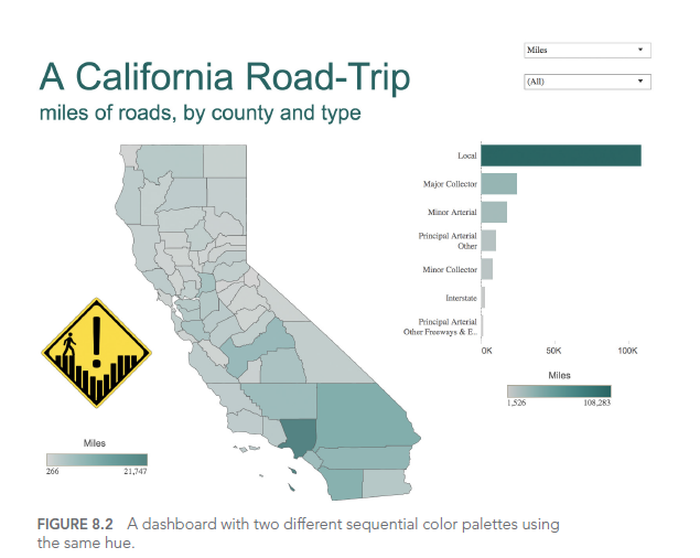
In this dashboard, the use of similar colors for different categories makes it difficult to distinguish between crime types. A better approach would be to use a clear, distinct color palette with high contrast between categories.
Pitfall 7B: Missed opportunities
Sometimes, in our quest for simplicity, we miss opportunities to enhance understanding through design. Thoughtful addition of visual elements can greatly improve engagement and memorability.
For example, consider this improved visualization of Edgar Allan Poe’s works:
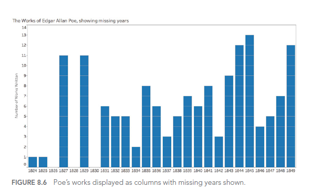
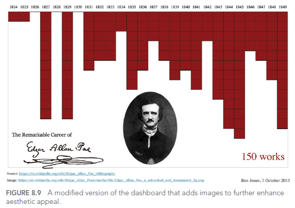
This visualization uses design elements to evoke the dark ambiance of Poe’s works, making the visualization more memorable and engaging. The inverted y-axis and blood-red color scheme add to the ominous feel, while the portrait and signature provide context and personality.
Pitfall 7C: Usability Uh-Ohs
Good design isn’t just about visual appeal; it must also consider usability. Visualizations that are difficult to manipulate or understand can frustrate users and limit the effectiveness of data communication.
Key usability considerations include:
- Intuitive navigation: Users should easily understand how to interact with the visualization.
- Clear labeling: All elements should be clearly labeled to avoid confusion.
- Responsive design: Visualizations should work well on various devices and screen sizes.
- Accessibility: Design should accommodate users with different abilities.
Here’s an example of a dashboard with potential usability issues:
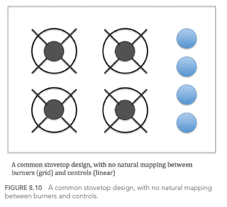
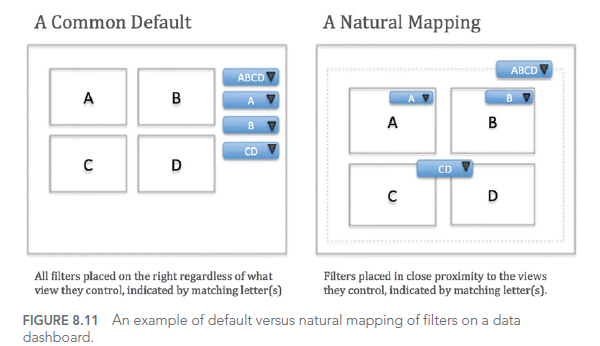
While this dashboard offers numerous interaction options, without careful user interface design, it can become overwhelming and difficult to use effectively. A better approach would be to simplify the interface, prioritize key information, and provide clear guidance on how to interact with the visualization.
CONCLUSION
In this final article of our series, we’ve explored the seventh type of error we can encounter when working with data: design dangers. We’ve seen how color choices, missed opportunities, and usability issues can affect the effectiveness of our data visualizations.
Throughout this seven-part series, we’ve covered a wide range of common pitfalls in working with data, from how we think about data to how we present it. By being aware of these pitfalls and learning how to avoid them, we can significantly improve our ability to work effectively with data and communicate valuable insights.
Remember, good design in data visualization is not just about making things look pretty. It’s about enhancing understanding, facilitating insights, and enabling better decision-making. As you continue your data journey, keep these principles in mind to create visualizations that are not only visually appealing but also clear, informative, and user-friendly.
This series of articles is strongly inspired by the book « Avoiding Data Pitfalls – How to Steer Clear of Common Blunders When Working with Data and Presenting Analysis and Visualizations » written by Ben Jones, Founder and CEO of Data Literacy, WILEY edition. We highly recommend this excellent read to deepen your understanding of data-related pitfalls and how to avoid them!
You can find all the topics covered in this series here: https://www.businesslab.mu/blog/artificial-intelligence/data-7-pitfalls-to-avoid-the-introduction/
